
SaaSGrid is now Grid! Read about our evolution here.
Business intelligence reporting is where data management and business operations meet. It takes data from systems like ERP, CRM, finance, marketing, and product platforms and turns it into structured outputs that teams can understand and use.
This guide brings together the most important ideas from the BI reporting articles, such as types of reports, common report formats, best practices, and a step-by-step reporting process. It also includes modern BI ideas like self-service, governance, and quick access to information.
BI reporting is the process of using BI tools to get data ready for analysis, then sharing what you find through reports, dashboards, visualizations, and automated outputs. The goal is to show performance, find patterns, cut down on the time it takes to gather data, and let people make decisions based on reliable sources and consistent definitions. BI reporting is often confused with descriptive analytics, take a look at this table to get a quick overview of the most important differences.
Some companies use BI reporting along with diagnostic, predictive, or prescriptive analytics, but the reporting layer is usually where insights are made available to more people through dashboards, charts, and scheduled distributions. However it’s important not to mix up both.
BI reporting is important because it cuts down on guesswork and makes sure everyone in the company is on the same page.
When teams use a shared reporting layer, they can keep an eye on KPIs all the time, compare performance over time, and reduce the number of mistakes brought about by the different interpretations that come from spreadsheets and definitions that aren't clear.
BI tools also should help day to day operations run more smoothly. Modern BI tools help analysts focus on interpreting and following up on data instead of putting together new data by automating the process of refreshing and sending out reports.
BI reporting typically includes both reports and dashboards, but they serve different needs.
SaaS companies and other types of businesses use both of these. Governed reports may be used by a monthly finance package, while operational leaders use dashboards to keep an eye on sales, inventory, or service levels in almost real time.
A common design choice in BI reporting is whether the company prefers managed reporting or ad hoc reporting.
Most mature BI programs use a mix of managed reporting for executive, financial, and compliance needs and self-service for exploration and everyday operational questions.
The concept of BI reporting include several different but related capabilities:
It enables business users to explore data and generate reports and dashboards without relying on IT for every request.
Using charts, maps, and trend views, interactive dashboards help teams understand performance and work together on shared KPIs.
Exporting reports to formats like PDFs and spreadsheets is still common for business processes that happen over and over. Alerts help people who are interested respond when metrics go over certain levels.
Some BI platforms use AI and machine learning to help with getting data ready, making insights, and talking to people in natural language.
Embedded BI lets you report on data that is already in your applications, and mobile BI lets you access data on different devices and in different field settings. Use this table to get a quick reminder of each of them when in doubt.
BI reporting is very complex and varies a lot in between organizations and sectors. However, all processes follow similar basic steps to make it repeatable and manageable.
How data is stored and managed has a big impact on reporting requirements. At first, data is spread out over different tools and spreadsheets. In later stages, data is usually stored in a central location, like a lake or warehouse, with curated datasets and standard definitions.
This maturity assessment affects the choice of tools, the way they are integrated, and how realistic near real-time reporting is.
BI tools can connect to data sources that are in the cloud or on your own servers. Most of the time, data needs to be cleaned, changed, and standardized so that metrics are the same across departments. Data preparation workflows and, when necessary, ETL processes are often used to do this.
Effective BI reporting starts with a clear decision context:
Answering the questions at this step keeps dashboards from getting too complicated and helps avoid the common mistake of good looking reports that aren’t actually used in real life.
You should choose KPIs based on your business goals, and all teams should use the same definitions. Ownership is important. A KPI that doesn't have an owner is just a number that people argue about instead of a signal that people manage. Standardized dashboards and shared datasets on BI platforms can help with KPI monitoring and benchmarking.
The design of a visualization affects how well people understand it and how much they trust it. The type of analysis should match the chart choice. The layout should be based on the audience and show what is most important. Dashboards usually work better with fewer high-signal visuals and clearer filters, while reports may work better with more narrative structure and deeper breakdowns. Many teams now wireframe dashboards before development, validating layout and KPI placement with stakeholders before any chart is built in Tableau or Power BI.
Governance is what makes it possible to have one source of truth at a large scale. It provides teams access controls, written definitions, and a consistent data lineage. Without governance, self-service can make numbers that don't match up even more confusing and make people in your team less likely to trust reports.
Automation should fit in with how your business runs. Scheduled refresh, email distributions, and alerts should be used when they cut down on the time between getting information and taking action.
BI reporting programs need to change and you should always be aware of it. Businesses change, definitions change, and stakeholders come up with new questions when they see data. The best reporting programs see feedback loops and regular updates as part of their normal work.
Choosing a BI reporting tool is as much a decision about how to run your business as it is about the product itself. Some criteria that always matter are:
Can it connect to the systems you rely on now, and can it adapt as your stack evolves?
Adoption depends on usability for non-technical stakeholders, not only analysts.
Reporting needs expand as data volume and user counts grow.
Role-based access and governance are foundational for enterprise reporting.
Cost includes licenses plus implementation, maintenance, and ongoing governance effort. Check out our article on the best revenue recognition software platforms for more details.
Use conversational AI for sales to make data more accessible and speed up decision-making.
Here’s a short and actionable guide for the best practices you can start implementing right now.
Define the decision and audience first, then design the report around that use.
Treat definitions as governed assets. Consistency matters more than perfection.
Self-service works best when datasets are curated and permissions are clear.
Emphasize key signals, use appropriate chart types, and avoid adding visuals that do not change decisions.
Schedule refresh and alerts when they meaningfully reduce delay between a change in performance and a corrective action.
Easy to read data helps you make decisions faster.
That’s why dashboards that show information clearly without adding extra complexity are the best for BI reporting.
If you choose the wrong chart, it makes it harder for everyone to understand the data because they’ll have to figure it out first. The right type of chart makes reports more focused and easier to read.
Your team can quickly understand what the data means when teams use the same chart formats and layouts. This helps keep everything clear and helps you act more quickly.
Let’s talk about the most important chart types and when to use them.
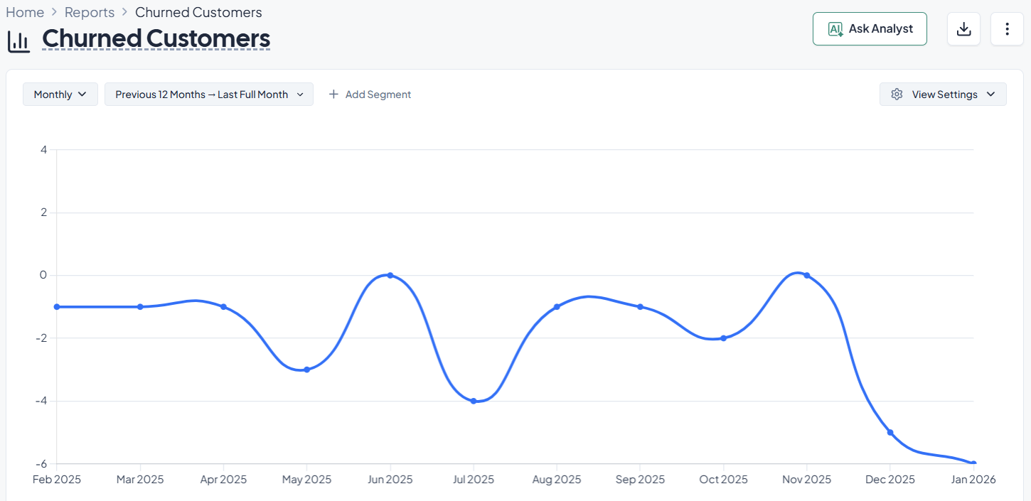
Line charts are best for showing how things have changed over time. They show patterns and direction without giving the reader too much information.
Common BI reporting use cases:
A finance team might use a line chart to see how ARR grows from month to month. The slope of the line quickly shows if growth is speeding up, leveling off, or slowing down.
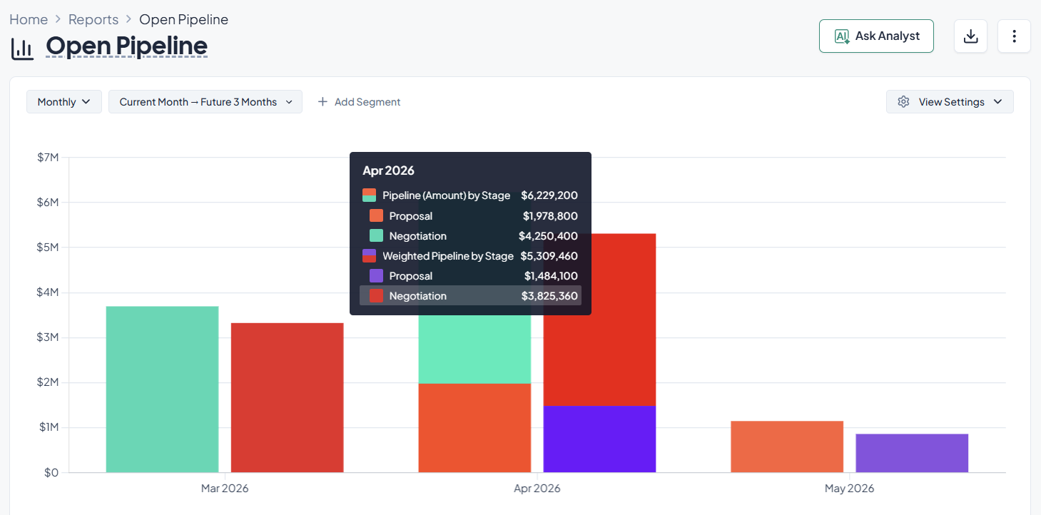
Bar and column charts are helpful when you want to compare values across categories. They make it easy to see how groups are different.
Common BI reporting use cases:
A column chart on a sales dashboard can show the value of the pipeline by region. Then, leaders can see which areas are doing well and where they might need to locate more resources.
Heatmaps are extremely helpful to find areas of high density or concentration in data. They make it easier to see patterns that would be hard to find in tables.
Common BI reporting use cases:
A support operations team can use a heatmap to show how many tickets they get each hour and day of the week. A heatmap helps you visualize quickly when demand is highest, helping your team plan their staffing accordingly.
Pie charts show how different groups make up a whole. Teams often use a pie chart maker to quickly visualize distribution data and present proportions in a more understandable format.
Common BI reporting use cases:
Keep in mind that it can be hard to understand a pie chart if it has too many parts. In those situations, a bar chart is usually clearer.
Descriptive BI reporting tells you what happened, but diagnostic analytics goes further and helps you and your team figure out why it happened. This distinction is important because companies often keep track of performance metrics without looking into what caused them.
When a dashboard shows an unexpected change in a KPI, diagnostic analysis usually starts. Then, analysts look at the data to figure out what factors had an effect on the result.
Imagine a RevOps dashboard shows a drop in total pipeline for the quarter. The initial report tells the team what happened. Pipeline decreased compared with the previous quarter.
A diagnostic report allows the manager to drill deeper into the data.
Possible investigations include:
After looking at these factors, the team might find that the pipeline drop happened because one marketing channel got fewer leads during a regional holiday. Another reason could be that tracking data stopped working because of a change in the configuration.
The organization only sees the surface problem without diagnostic analysis. Reporting on diagnostics links changes in performance to certain operational factors.
The structured process of finding the reasons for a change in performance is called root cause analysis.
BI tools helps you go through this process with various tools, including:
Drill down analysis lets you go from a broad metric to more specific information. You can look at regions, products, or sales reps to see where the change happened if a dashboard shows that revenue dropped this month.
This method divides a metric into smaller groups based on certain traits. Some common attributes are the region, the type of customer, the pricing tier, or the acquisition channel. Segmenting metrics lets teams see how each part of the business affects the whole.
Teams can see trends and changes in performance by comparing data from different time periods. You could look at this month's pipeline and last month's pipeline, or this quarter's revenue and last quarter's revenue, to see if there are any patterns of growth, decline, or seasonality.
Filtering lets you look at only a certain part of the data without changing the report itself. Teams can look at how different groups act and find areas that need work by filtering dashboards by customer type, product category, region, or deal size.
For instance, a business might see a significant churn increase. Then, the diagnostic analysis shows that customers who paid a certain amount were more likely to leave. That information gives the product and customer success teams a clear path to follow for their research and response.
When teams use both descriptive dashboards and diagnostic analysis, they don't just keep an eye on metrics; they also work to make them better.
It’s common for all young companies to start their analytics journey with data from many different places and manual spreadsheet reports.
While this is the cheapest and sometimes the best solution at the start, as they keep growing, they’ll need to switch to more structured BI systems that store data in one place and do reports automatically.
Most businesses start out in what data teams call the source data stage. Data is found in many places, including spreadsheets, CRM systems, marketing platforms, and product databases.
At this point, teams often export data and then put it together by hand in spreadsheets. Analysis takes a long time, and reports get old quickly.
A common transformation path includes the following steps:
Once the data is centralized, reporting becomes faster and more consistent. Teams no longer spend hours reconciling spreadsheets. Instead, they work with shared dashboards that update automatically.
Organizations often report that this transition reduces reporting preparation time significantly and improves alignment across departments.
Another important step in BI maturity is automation. Scheduled data refreshes and automated alerts help businesses react faster to changes in performance.
Think about a marketing operations team that keeps an eye on how well campaigns are doing.
Analysts might update reports once a week in a manual workflow. The team might not notice a drop in campaign performance until the next reporting cycle if it happens in the middle of the week.
Automated BI dashboards change this process by providing you with:
With these tools, teams can find changes in performance faster and respond more quickly. This makes it easier to find a problem and fix it faster.
The result is a clear decrease in the time it takes to make a decision. Organizations change their strategy in almost real time instead of weeks later.
These improvements add up over time. Teams don't spend as much time writing reports anymore. Instead, they spend more time looking at performance and finding ways to make things better.
Use the checklist below to operationalize BI reporting in a way that supports decisions.
BI reporting is the process of using BI tools to prepare, analyze, and show data in the form of dashboards, reports, and visualizations that stakeholders can understand and act on.
Dashboards usually show a high-level view of important metrics that can be interacted with and are updated often. Reports are usually more detailed, come out on a regular basis, and are used to look at a topic more deeply.
Self-service BI users can look at data and make reports without having to ask IT for help every time they need something. When used with governed datasets and clear permissions, it can speed up the process of getting insights.
Data governance makes rules about who can see data, how good it is, and how consistent it is so that everyone can trust what they see. Without governance, organizations often have a lot of numbers that don't match up and fewer people using them.
People often call BI a decision support tool because it looks at both current and past business data and shows it in ways that help everyone in the company make decisions.
Business intelligence reports are organized results made from looking at a business’ data to help with monitoring, analysis, and making choices. They use tables, charts, and other visual aids to show metrics, trends, and comparisons. Business intelligence reports can be static, like monthly performance reports, or dynamic, like interactive dashboards that automatically update when new data is available.
Their main job is to make it easy to understand and compare complicated data over time, between teams, or between business units. Using consistent definitions and trusted data sources, well-designed BI reports let stakeholders quickly check performance, find problems, and confirm decisions.
Business reports that are made by hand, don't change, and are usually sent out as spreadsheets or PDF documents. BI platforms that connect directly to data sources, refresh automatically, and allow for interactivity create real business intelligence reports.
BI reports also stress the importance of consistency and governance. Metrics are based on centralized datasets instead of being put together by hand, which cuts down on differences between teams. This makes BI reports better for managing performance over time and making decisions across departments.
Business intelligence reporting tools are software programs that help you gather, organize, analyze, and show data in reports and dashboards. These tools connect to data sources like databases, cloud apps, and data warehouses. They then let users make reports and visualizations without having to write a lot of code.
BI reporting tools usually have features like data connectors, data modeling, interactive dashboards, scheduled report delivery, and access controls based on roles. Some tools also let non-technical users look at data on their own within set limits.
Business intelligence analytics is the name for the ways that BI systems analyze business data. It mostly does descriptive and diagnostic analysis, which means it answers questions about what happened, what is happening now, and why certain results happened.
Trend analysis, period-over-period comparisons, segmentation, and drill-down exploration are all common parts of business intelligence analytics. Some BI platforms also offer predictive or augmented analytics, but the main focus of BI analytics is still on understanding how things have gone in the past and how they are going now.
Business intelligence analytics uses structured business data and standard metrics to help make decisions about operations and strategy. Data science uses advanced algorithms, machine learning, and statistical models to find patterns, make predictions, and look at both structured and unstructured data.
In the real world, BI analytics and data science work well together. BI analytics gives you a way to see and keep an eye on things, while data science is often used for things like testing, predicting, and improving things beyond just reporting.
A lot of people use business intelligence reports, such as executives, finance teams, operations managers, sales leaders, analysts, and front-line managers. Different groups usually read BI reports at different times and with different levels of detail.
High-level dashboards may be enough for executives, but analysts and managers need more detailed reports to figure out what makes things work. Modern BI reporting tools let you see the same data in different ways, which helps with this variety.
How often business intelligence reports are updated depends on the business situation and how often decisions are made. Operational dashboards may update every day or almost in real time, while financial and strategic reports are usually updated once a month or once a quarter.
The goal is to make sure that refresh schedules match how quickly teams can use the information. Updating reports more often than decisions are made can make things more confusing without making things better.
A good business intelligence report has a clear goal, a specific audience, and a direct link to decisions. It uses the right kinds of visuals, doesn't make things more complicated than they need to be, and emphasizes the most important metrics.
Trust is another thing that affects how well something works. Reports that use governed data with clear definitions are more likely to be used by all teams.


Explore Stripe alternatives and find the right fit for billing, payments, and finance workflows as complexity grows.

Compare five SaaS analytics tools and see how each supports revenue, product insights, and decision making.

Craft Partner Michael Robinson joins Grid to discuss how to build your 2023 financial plan.


