
SaaSGrid is now Grid! Read about our evolution here.
A lot of teams still do planning and forecasting the hard way.
Your financial metrics live in one system. Your operational metrics live somewhere else. Your plans are in a spreadsheet. Then when somebody asks a basic question like, “Are we on track?” or “What does next quarter look like?” you end up pulling exports, cleaning up data, rebuilding charts, and trying to line everything up by hand.
That is exactly the problem we wanted to solve.
In this webinar, we walked through three updates in Grid that make that work a lot easier:
The bigger idea is pretty simple. You should be able to see your financial metrics, your operational metrics, your forecast, and your plan in one place without doing the same spreadsheet work over and over again.
Most teams are not short on data. They are short on a clean way to use it.
You might already have ARR in Salesforce. You might have billing data in Stripe. You might have financial reporting in QuickBooks or another system. But then there are all the other metrics that matter to the business and do not sit neatly inside those tools. Things like support tickets, implementation volume, product usage, onboarding backlog, or whatever else your team tracks operationally.
Those numbers usually end up in spreadsheets.
And once that happens, the reporting gets fragmented. Finance is looking at one set of numbers. Ops is looking at another. Sales is working off pipeline data. Leadership wants to compare all of it against plan. Everyone is trying to answer the same question from different places.
That is where the process starts to get messy. You export. You aggregate. You rebuild. Then you do it again next month.
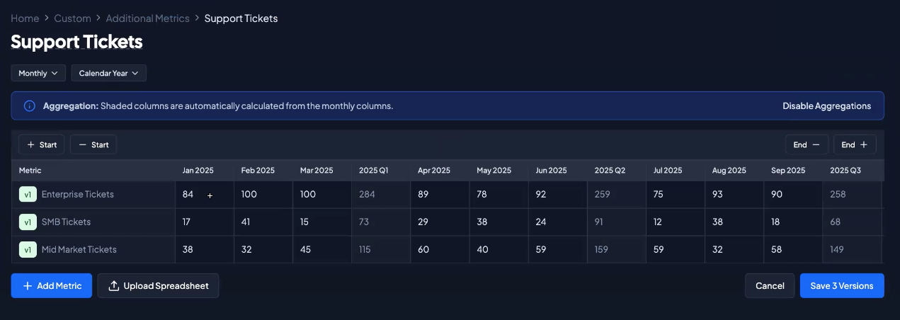
The first feature we walked through was custom data, which now includes additional metrics you can upload directly into Grid.
This is built for the metrics that are important to the business but do not always live in your core financial systems. In the webinar, we used support tickets as the example. We created a new collection, uploaded a spreadsheet, and brought in monthly support ticket data broken out by SMB, mid-market, and enterprise. Grid read the spreadsheet directly, recognized the rows as separate metrics, and let us import them into the platform.
That matters because it gives you a way to bring operational data into the same reporting environment as your financial data.
Instead of saying, “ARR is over here, and support volume is somewhere else,” you can put those metrics side by side in the same chart. In the webinar, we added enterprise support tickets from the spreadsheet and compared them directly against ARR from Salesforce. One metric came from a spreadsheet. The other came from a system integration. Both showed up in the same report.
That opens up a lot of useful reporting.
You can look at financial performance next to operational load. You can compare growth against service demand. You can start to see whether the business is scaling cleanly or whether one part of the organization is starting to strain while revenue grows.
It is also flexible. If your data already exists in a spreadsheet, you do not need to rebuild it from scratch. You can upload it, create the metrics, and then update them later as new periods come in. The webinar also touched on format flexibility here. Monthly, quarterly, and annual data can all work, as long as the spreadsheet is structured clearly enough for Grid to read it.
For teams that still rely on spreadsheets for important operating metrics, this is a much cleaner bridge between ad hoc reporting and a real system of record.
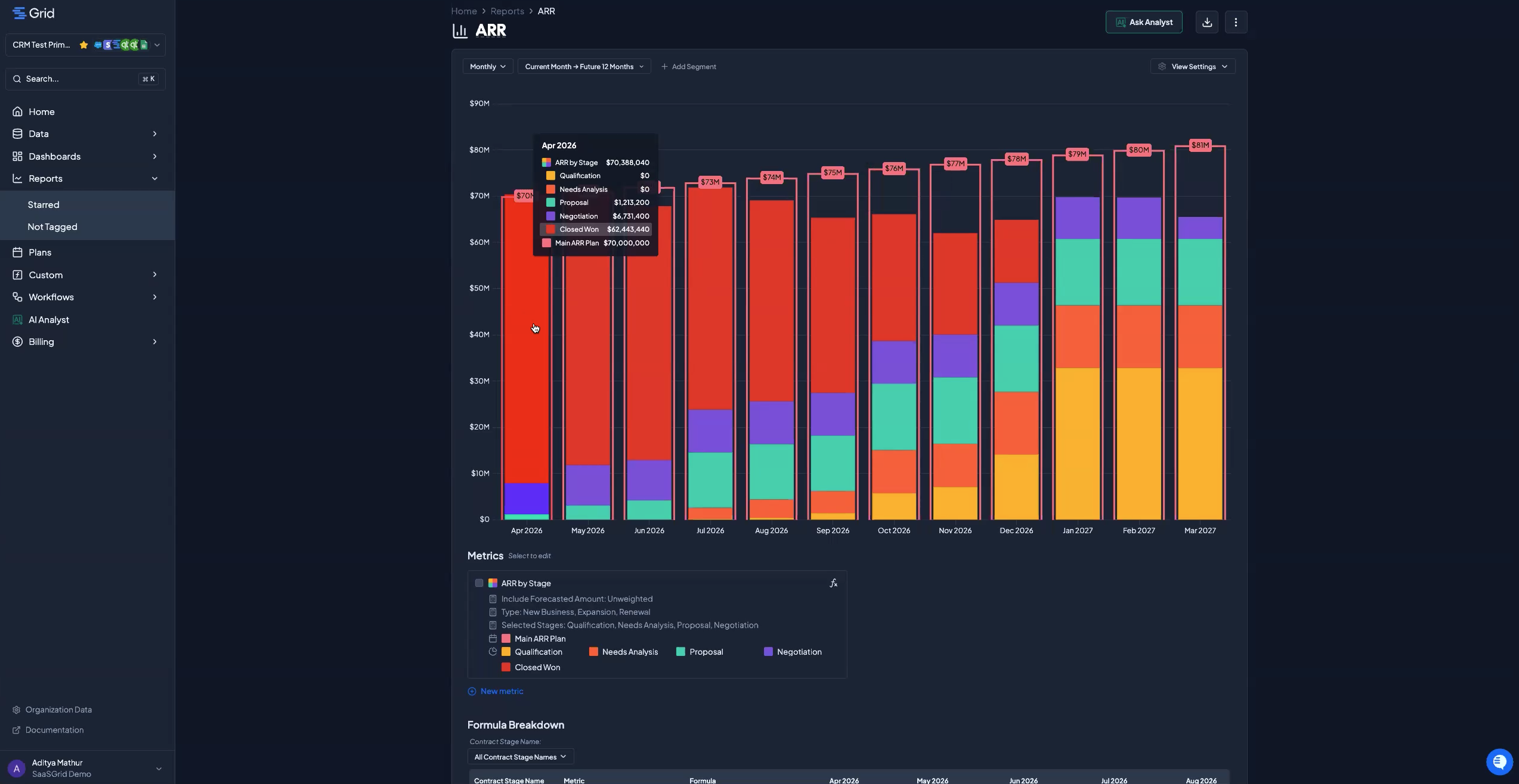
The second big feature in the webinar was forecast mode on ARR metrics.
This is for the very common situation where your current ARR view is technically correct, but not complete enough for planning.
For example, if you look forward 12 months and only include what is already closed won, you might see ARR drop as contracts expire. That is useful as a baseline, but it is not always how the business is actually expected to perform. You may have deals in pipeline that are likely to close. You may have renewals in motion. You may have expansion opportunities you want reflected in your forward-looking view.
Forecast mode lets you include those forecasted amounts in ARR, MRR, and revenue metrics. In the webinar, we showed how you can switch from a view with no forecast included to one that pulls in CRM pipeline data. From there, you can choose which deal types to include, such as new business, expansion, and renewals, and decide whether you want the forecast to be weighted or unweighted.
That gives teams a more realistic picture of where revenue may be headed based on the pipeline they already have.
This is especially useful for revenue leaders, RevOps, and FP&A teams who need to answer questions like:
Without a forecast layer, those questions usually require separate analysis outside the reporting tool. With forecast mode, they become part of the same chart.
One of the more useful parts of the demo was not just turning forecast mode on, but grouping the metric by opportunity stage.
That is where the chart becomes much more actionable.
In the webinar, we showed how the red bars represented closed won ARR, while the remaining forecasted amount reflected pipeline in other stages. Early in the timeline, more of the ARR was closed won. Further out, there were fewer closed won deals and more open pipeline carrying the number.
That distinction matters.
It is one thing to say, “We forecast this ARR number.” It is another thing to show how much of that number is already booked and how much depends on future deals closing.
That makes the chart more useful for planning conversations. Sales leaders can look at the pipeline contribution and pressure test whether it is realistic. Finance can see where the forecast is solid and where it is more assumption-driven. Leadership can understand not just the number, but the quality of the number.
And because weighted forecasting is also available, you can choose whether to reflect a more conservative picture based on deal stage probability, or a fuller picture using unweighted pipeline.
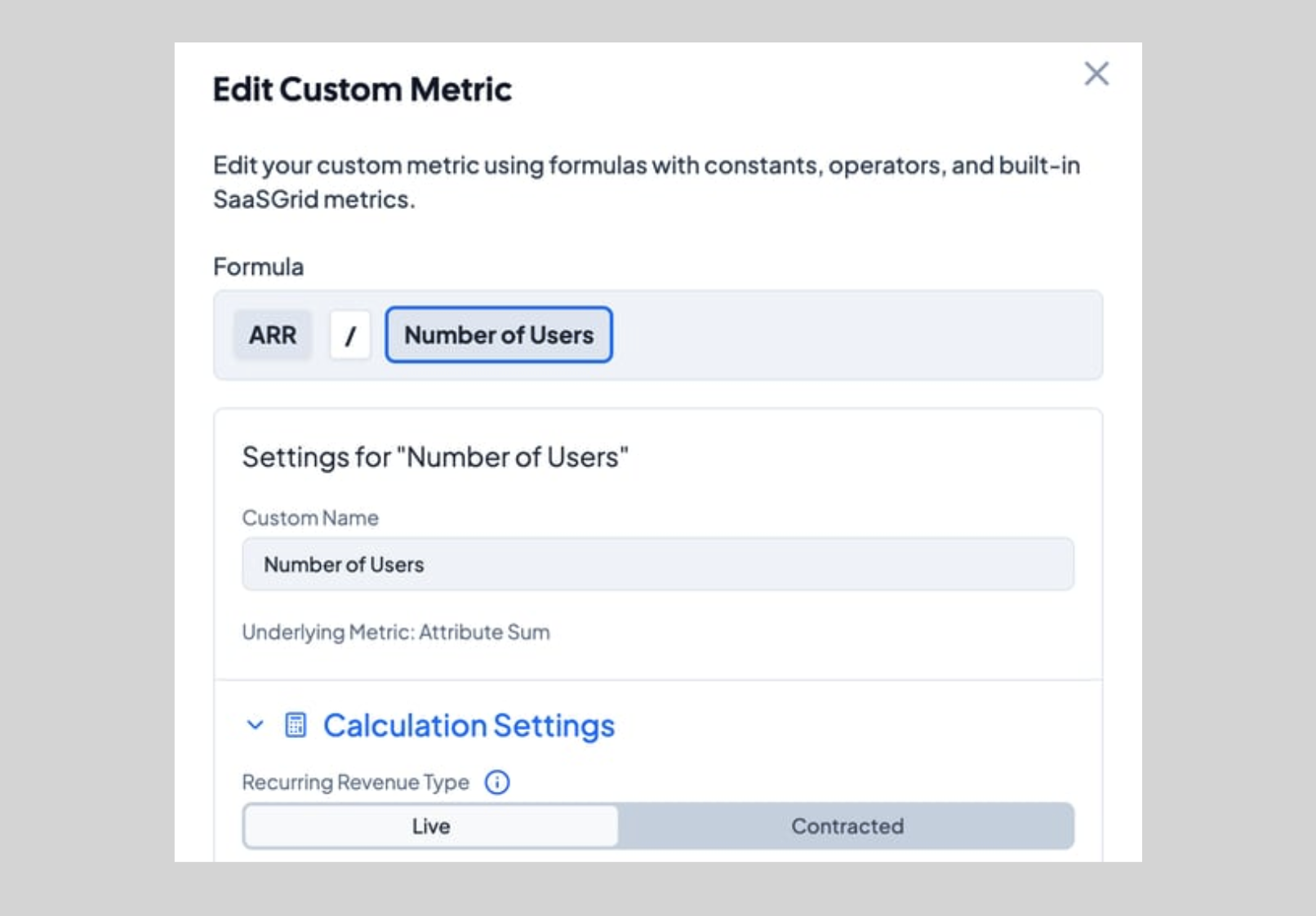
The third part of the webinar focused on plans.
We showed that plans can now be created in a similar way to custom metrics. You can upload them from a spreadsheet or add them manually. Once the plan is in Grid, you can overlay it directly on top of your actuals and forecasted metrics in the same chart.
This is where things get really useful.
Instead of comparing performance in one place and plan in another, you can see the relationship directly:
All in one view.
In the webinar, we added an ARR plan to the chart and displayed it as an outline on top of the ARR data. That immediately made the gap visible between what the business has already closed, what is still sitting in pipeline, and what the target says needs to happen.
That is a much better setup for decision-making than reviewing these pieces separately.
You do not have to guess whether the current pipeline supports the target. You can see it. You do not have to bounce between a forecast file and a board deck. You can compare them in one place.
For teams doing monthly reviews, board prep, or quarter-end planning, that kind of visibility saves time and reduces a lot of back-and-forth.
The other nice thing about plans is that they are not only for fixed targets.
In the webinar, we also talked about using them for scenario planning and what-if analysis. Once you know where your metric stands today, you can create different future views based on different assumptions and show how those assumptions change the path forward.
That is especially relevant for FP&A teams and revenue leaders right after quarter close, when people start asking:
Traditionally, that work happens in separate forecasting models and spreadsheet tabs. Here, you can build those views in a way that stays connected to the same metrics you are already reporting on.
It is a cleaner way to move from hindsight reporting into forward-looking planning.
The individual features are useful on their own.
Custom metrics help you bring in the operating data that usually gets left out. Forecast mode helps you turn ARR into a forward-looking metric instead of just a historical one. Plans help you compare where you are against where you are trying to go.
But the real value is what happens when those pieces come together.
You can put actuals, operational KPIs, forecasted pipeline, and targets on the same screen. You can update them without rebuilding everything manually. And you can use the same environment for reporting, planning, and scenario analysis.
For a lot of teams, that is the difference between spending time preparing numbers and spending time actually using them.
A lot of planning work still breaks down because the data is scattered and the process is too manual.
These updates are meant to make that simpler.
If your team is still pulling financial data from one place, operational data from another, and plans from a spreadsheet just to answer basic questions about performance, this is a much better way to work. You can bring those inputs together in Grid, compare them side by side, and get to the discussion faster.
A useful next pass would be tightening this into a more SEO-driven version for the Grid blog, with a stronger headline, meta description, and a clearer keyword focus around revenue forecasting, ARR planning, and mid-market SaaS.

Build your own metrics and see your pipeline down to the day!

Explore Stripe alternatives and find the right fit for billing, payments, and finance workflows as complexity grows.
Compare five revenue cycle analytics tools and learn how they improve visibility, cash flow, and RCM decisions.

Five SaaS enterprise solutions that make your business more efficient, coordinated, and able to grow.

