The Top 5 KPI Reporting Software + What KPI Reporting Do You Need?
Let’s compare KPI dashboard software to help your team track metrics, monitor trends, and choose the right tool.
By Ethan Ruby, Grid Co-Founder and CEO
The right KPI software turns numbers into action. Accurate KPI reporting cuts through the noise of data and tells you what really matters. You don't have to argue over definitions or look through spreadsheets, you can just see the actual numbers updated in real time.
This is even more important for SaaS companies. Subscription businesses are always changing their plans based on how many customers they keep, how many new customers they get, how healthy their pipeline is, and how much money they are spending.
Metrics for SaaS are not the same as those for regular businesses. You are not only keeping track of your income; you are also keeping track of how it changes over time.
1. Revenue Intelligence and Recognition
SaaS teams must standardize recurring revenue calculations. That means:
Recurring Revenue, MRR, ARR
Revenue movements broken into new, expansion, contraction, and churn
Clean revenue recognition logic as contracts become more complex
Without standards to follow, Sales, Finance, and RevOps can end up calculating ARR differently, destroying trust in all reporting.
Strong KPI software should help SaaS teams move faster, stay aligned, and eliminate manual reporting work. Below are the core features that matter most — plus brief notes on what each recommended tool is best used for.
Real time monitoring
What It Means
Why It Matters
Dashboards update automatically as source data changes.
Helps teams catch churn early, monitor pipeline health, and adjust forecasts before problems grow.
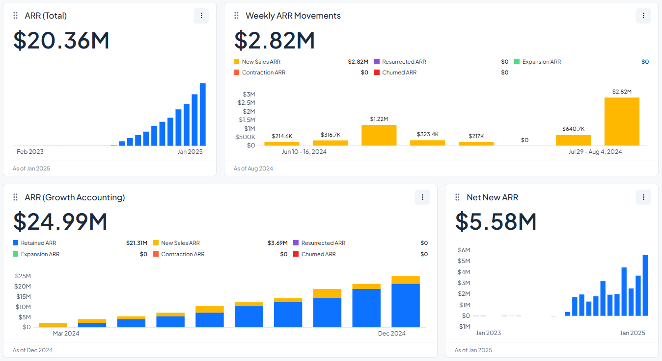
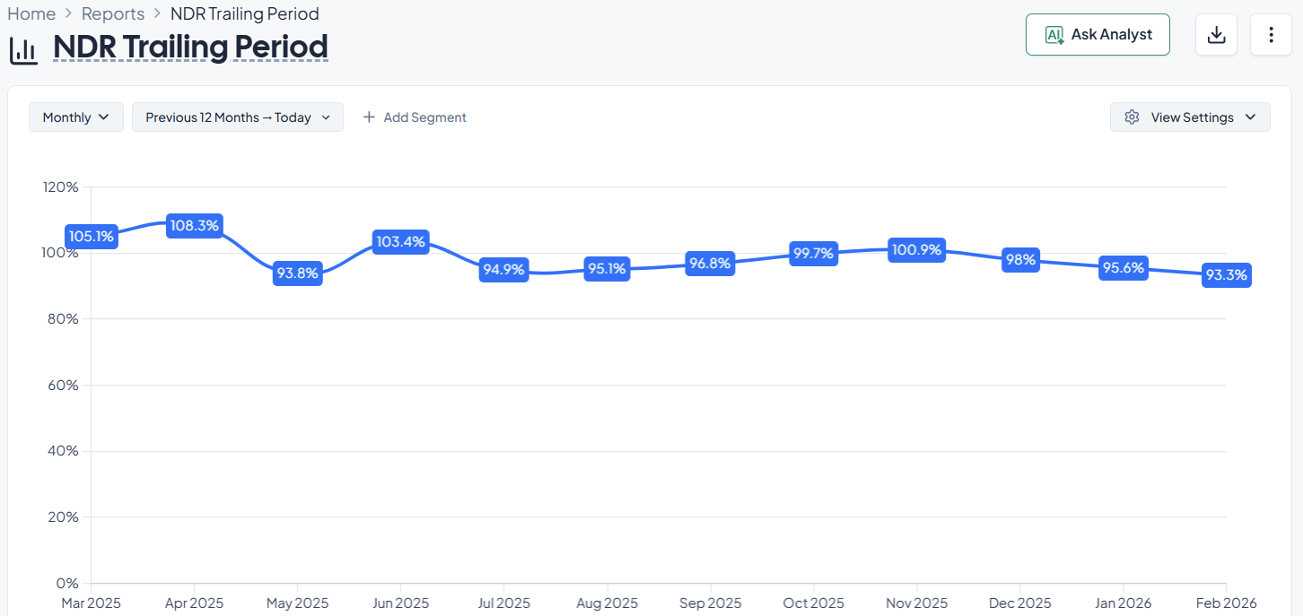
This software helps subscription businesses keep an eye on their most important performance metrics and see their recurring revenue metrics in real time.
It standardizes the way important metrics are calculated and shown:
Monthly recurring revenue (MRR)
Churn
Customer lifetime value (LTV), etc.
Thus making revenue recognition workflows easier and more consistent across teams.
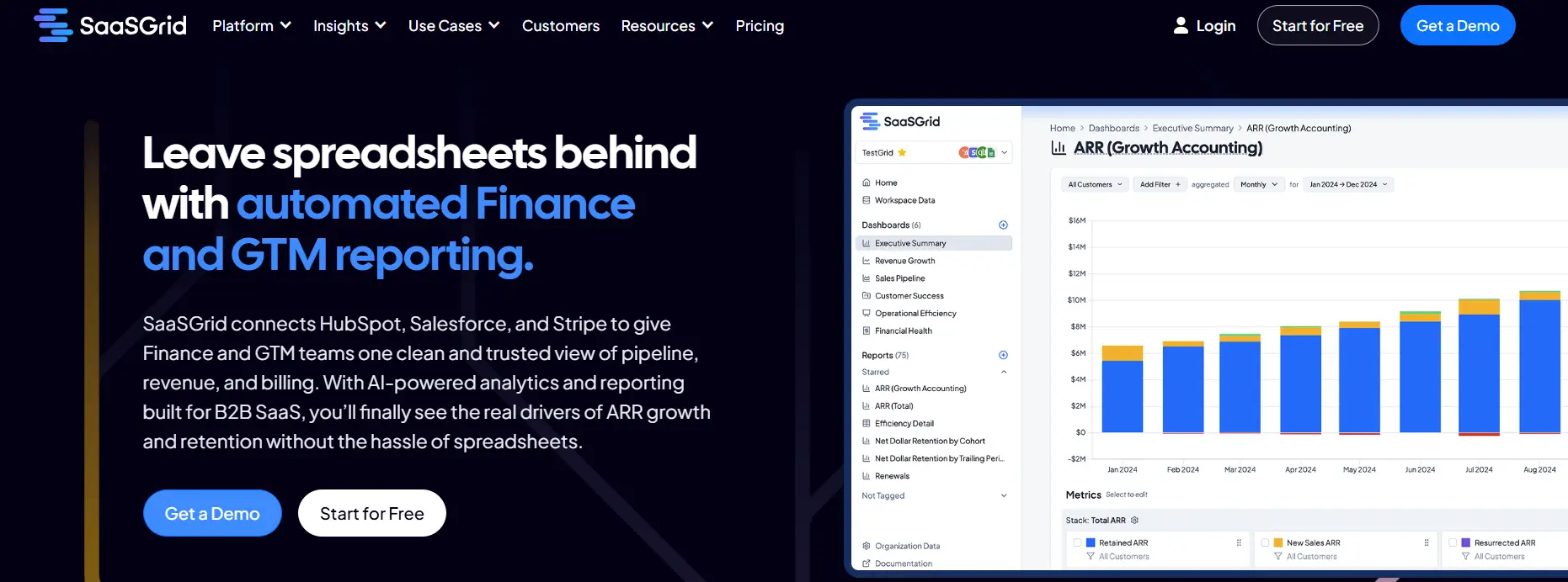
Grid is our pick for the best KPI dashboard software for SaaS companies because it combines billing, CRM, and financial data into centralized dashboards that automatically update when the source data changes.
It comes with built-in KPIs, segmentation, and automated reporting that make it easy for you and your team to keep an eye on trends, operational performance, and revenue health without wasting time making dashboards from scratch or dealing with spreadsheets.
People often say that automated KPI tracking saves them time that they would have spent on spreadsheets or manual queries.
For anyone looking for free KPI dashboard software, Grid's basic analytics, available in its free plan, make it easier for finance and RevOps teams to get immediate insights and keep their operations straight, with the option to scale to a paid plan if it fits your needs.
What Users Like About Grid for KPI Dashboards
Automated KPI dashboards that replace manual reporting
Users frequently say that Grid simplifies KPI dashboards by automating recurring reporting and reducing reliance on spreadsheets.
“Grid helps automate reporting processes, reduce manual errors, and provides actionable insights for businesses to make informed decisions quickly.”
–
Annie C.
Real-time visibility into SaaS KPIs
Reviewers often highlight that Grid centralizes KPI tracking and keeps dashboards updated without manual exports or refresh cycles.
“This allowed us to eliminate manual data export and reporting and view key metrics in real time.”
–
Sam H.
Clear dashboards for ongoing performance monitoring
Users say Grid helps teams monitor core SaaS KPIs over time and understand performance trends more easily.
Grid provides in-depth KPI dashboards and reporting, but some users point out challenges related to setup complexity, dashboard customization, and feature maturity.
Advanced setup required for KPI dashboards
Some users mention that the depth of Grid’s KPI dashboard software means it can take time to learn and configure effectively.
Limited configuration in certain dashboard views
A few reviewers point out constraints when customizing specific KPI dashboard views.
“A few small admin report/dashboard configuration limitations.”
- Sam H.
Feature maturity as the platform evolves
Some users note that Grid is still expanding its capabilities as the product continues to develop.
“As Grid is still relatively new, some features are still being built out.”
- Annie C.
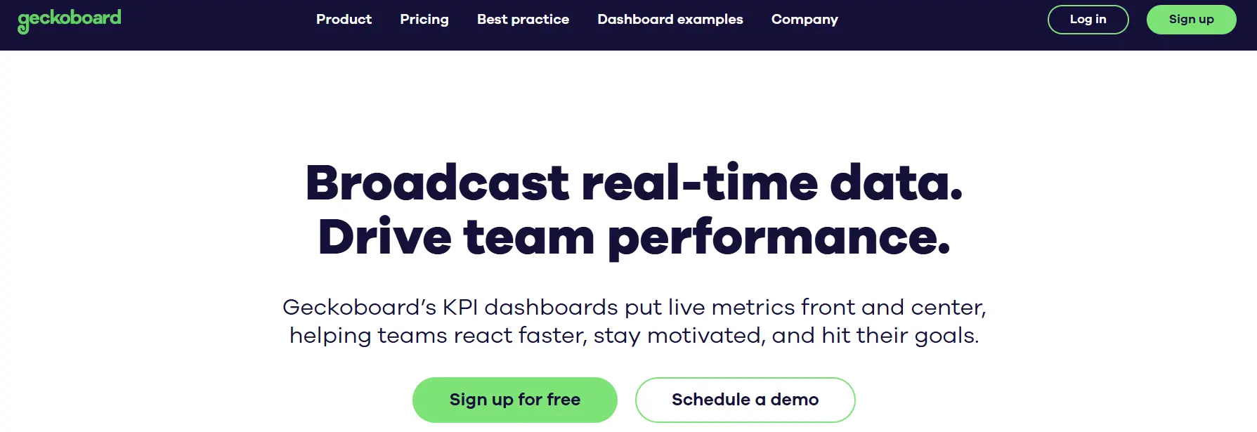
2. Geckoboard: KPI Dashboards That Tracks Metrics In Real Time
Geckoboard is a KPI dashboard tool that lets teams see and keep an eye on key performance indicators across all areas of the business.
Price
$60 to $319/month
Ideal use case
Small to medium-sized businesses and internal teams
It helps businesses recognize revenue by letting them visualize some of the most important revenue metrics and trends on live dashboards. This helps teams keep track of how well they're doing over time without having to update spreadsheets by hand.
Geckoboard helps teams track metrics, understand them, and use them. It connects to many data sources, so users can pull metrics from databases, cloud tools, and analytics platforms into one dashboard.
Its users often say that it's easy to set up widgets and that they update automatically, which makes it easier to keep scorecards up to date.
In general it provides teams that need to see sales, financial performance, or operational KPIs in real time a visual tool that makes it easier to understand the data and get everyone on the same page with the same metrics. Unfortunately it lacks forecasting capabilities so any finance teams looking for something beyond KPI tracking and reporting, might feel it falls short.
What Users Like About Geckoboard for KPI Dashboards
Dashboards that stay up to date without manual refreshes
Teams use Geckoboard to keep KPI displays current so they can monitor performance and check in more frequently without manual updates.
“The ability to bring in data from many sources and automatically without having to refresh or update.”
–
Matt S.
Easy setup with a clear, shareable layout
Reviewers say the layout is designed for sharing KPI status widely and that dashboards are straightforward to set up and present.
“Quality of output design, the tables are striking, it's also very easy to setup.”
–
Stephane m.
Simple KPI sharing across teams
Users say Geckoboard makes it easier to keep teams aligned on KPI definitions and goals through a shared, visual view.
Geckoboard is commonly used for KPI visualization, but some users point out limitations related to customization, integrations, and analytical depth.
Limited flexibility in visualization for certain use cases
Some users say they run into constraints when trying to create more personalized KPI views or apply specific formatting options.
“There were a few times I wanted to show specific data in differ...ns weren't available.”
- Peter L.
Missing or delayed integrations
Some reviews mention having to wait for key integrations, which can slow the rollout of KPI tracking across multiple tools.
“Dislike would be an unfair word to use, but I am waiting for them to add more integrations at the moment!”
- Annie V.
Limited depth beyond KPI display
A few users describe Geckoboard as effective for displaying KPIs but lacking deeper analysis or exploratory capabilities.
3. Power BI: KPI Dashboards for a Clear Business View
Power BI is a cloud-based business intelligence platform that lets users track, visualize, and analyze metrics in finance, sales, operations, and marketing.
Price
Free to Custom Pricing
Ideal use case
Technical teams that transform data into interactive visual dashboards
It helps with revenue recognition by combining transactional and billing data into standard KPI views. Thanks to this, users can track revenue performance over time in a consistent way, reducing errors. These features make it a common place for teams to start standardizing KPI reporting.
Power BI also connects to many different types of data sources, such as Excel, SQL databases, cloud services, and ERP systems, to track KPIs. Users can make interactive dashboards that keep an eye on revenue, growth, churn, and operational efficiency in almost real time. Role-based access, automated data refresh, and calculated measures all help keep things consistent between teams.
Power BI is a good choice for organizations with the manpower and knowledge to manage its flexible modeling and visualization options
What Users Like About Power BI for KPI Dashboards
Clear reporting and KPI visualization at scale
Users say Power BI can turn raw data into structured KPI dashboards that help teams track performance over time.
“What I like most about Power BI is how it turns complex data into interactive dashboards and reports, all in one place.”
–
Mohammed Bilal O.
Flexible dashboard creation and exploration
Reviewers say that once data models are in place, Power BI makes it easier to build, adjust, and explore KPI dashboards without heavy technical work.
“Creating dashboards and reports is straightforward, and viewing them is intuitive.”
–
Neelanjana M.
Helpful for ongoing KPI reviews across teams
Users say Power BI supports regular reporting and recurring KPI reviews across business functions.
“Power BI has helped us create dashboards that align well with our business needs.”
–
Robert D.
What Users Dislike About Power BI
Power BI is widely used for KPI dashboards and analytics, but some users report challenges related to performance, licensing complexity, and data modeling effort.
Performance issues with large or complex datasets
Some users say that KPI dashboards built on large models or requiring frequent refreshes can become less responsive.
“One of the main limitations I find in Microsoft Power BI is performance when handling large datasets in high-demand environments.”
- Ivan B.
Feature limitations tied to licensing tiers
Reviewers note that some advanced KPI dashboard features require higher-tier licenses, which can restrict access for broader teams.
“Some advanced features are locked behind higher-tier licenses.”
- Neelanjana M.
Complexity in building and maintaining data models
Users say that keeping KPI dashboards accurate requires careful data modeling, which can be difficult for teams without strong technical expertise.
“What I don’t love about Power BI is that, while it’s super powerful, the data modeling side can be tricky and not always easy to manage.”
- Mohammed Bilal O.
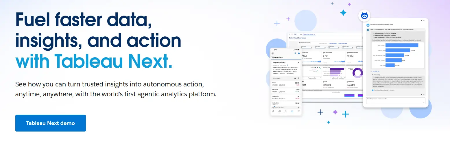
4. Tableau: Dashboards for KPIs that Can Be Customized
Tableau is a data visualization tool that teams can use to make interactive KPI dashboards to help them keep track of performance in key areas like revenue, operations, and customer metrics.
This software helps with revenue recognition by combining financial and operational data into dashboards that stay up to date with live or refreshed data sources, which means teams don't have to rely on static spreadsheets as much.
As a software for tracking KPIs, Tableau focuses on visual exploration and interactive dashboards.
Users can make KPI dashboards that show trends, outliers, and how far along they are toward their goals by dragging and dropping parts. Many reviews mention that Tableau can handle large datasets and help executives and operational teams review KPIs periodically.
It connects to cloud data warehouses, databases, and SaaS tools, letting users keep an eye on KPIs across all departments. Businesses that use it usually have a technical-oriented team ready to manage the platform and value flexible visualization and in-depth KPI analysis over pre-made templates.
What Users Like About Power BI for KPI Dashboards
Clear reporting and KPI visualization at scale
Users say Power BI can turn raw data into structured KPI dashboards that help teams track performance over time.
“What I like most about Power BI is how it turns complex data into interactive dashboards and reports, all in one place.”
–
Mohammed Bilal O.
Flexible dashboard creation and exploration
Reviewers say that once data models are in place, Power BI makes it easier to build, adjust, and explore KPI dashboards without heavy technical work.
“Creating dashboards and reports is straightforward, and viewing them is intuitive.”
–
Neelanjana M.
Helpful for ongoing KPI reviews across teams
Users say Power BI supports regular reporting and recurring KPI reviews across business functions.
“Power BI has helped us create dashboards that align well with our business needs.”
–
Robert D.
What Users Dislike About Tableau
Tableau is widely recognized for advanced analytics, but some users report drawbacks when it comes to simple KPI use cases, cost at scale, and competition from lower-priced tools.
Overhead for basic KPI dashboard use cases
Some users feel that Tableau is more complex than necessary when creating or maintaining simple KPI dashboards.
“Sometimes it feels a bit too much for simple tasks.”
- Ayush K.
Cost concerns when scaling dashboard access
Pricing is a common concern, especially for teams that want to give KPI dashboard access to a larger number of users.
“One of the biggest challenges with Tableau is the pricing model.”
- Anil K.
Pressure from lower-cost KPI dashboard alternatives
Some users note that licensing costs influence adoption when comparing Tableau with more affordable KPI dashboard tools.
“Due to high cost of the license, many users are shifting to Power BI nowadays.”
- Laxman C.
5. SimpleKPI: A lightweight way to track KPIs for structured reporting
SimpleKPI is a software that helps teams set, keep track of, and review performance metrics in an organized way.
It helps with recognizing revenue by letting businesses track revenue-related KPIs, targets, and trends over time using clearly defined measures instead of random reporting.
SimpleKPI works by allowing its users to enter data by hand or with some automation via spreadsheets, assigning KPIs to people, and having regular review cycles.
Teams can make KPI scorecards, give people tasks, set limits, and see how they're doing with dashboards and reports. This method works for businesses that value governance, accountability, and regular performance reviews more than real-time analytics.
SimpleKPI is a simple tool for businesses that want to see and control their data without having to deal with complicated data pipelines making it a very focused tool. While some will appreciate its simplicity, larger SaaS businesses could find its lack of integrations and features lacking as they grow.
At the time of writing it only has 2 public user reviews, which makes it hard for new users to confirm its usefulness.
Conclusions
The right KPI dashboard software for a business depends on how much structure, automation, and freedom it needs.
Grid and other tools focus on standardizing SaaS metrics and automating reporting. On the other hand, Power BI and Tableau focus on customization and in-depth analysis. Geckoboard and SimpleKPI are easier options for teams that value clarity and governance over complicated modeling.
Knowing about these trade-offs helps teams choose software that meets their operational and reporting needs.
Ethan Ruby
Co-Founder and CEO at Grid. Ethan has over 10 years of experience in SaaS. He created Grid to help businesses get clear data without having to spend hours wrangling data and writing SQL queries.
With Grid, you can skip the manual work and instantly access accurate metrics and actionable insights into every aspect of your business to drive sustainable, profitable growth.