Every SaaS company, no matter how big or small, needs a basic set of analytics tools. At the very least, that usually means:
Subscription analytics to track MRR/ARR, churn, and expansion
CRM reporting to understand pipeline, win rates, and lead sources
Retention analytics to measure logo retention, GRR, and NRR
Forecasting tools to project revenue and identify risk early
Dashboards or BI tools to unify data into a clear source of truth
But not every SaaS company needs the same level of complexity.
Before you buy any analytics software, you need to know what stage your business is in and what decisions you need to make or you might run into one of two problems:
You overbuild: Putting money into heavy enterprise-grade systems slows down your team and costs more than they need to.
You underbuild: Manual work builds up due to lightweight dashboards that can't do segmentation, forecasting, or renewal visibility as you grow.
Analytics tools should match your business motion, not just your ambition.
Let’s break down what tools you actually need at each segment, what problems they should solve, and what failure patterns to avoid.
What segment am I catering to
There are many ways to categorize SaaS businesses, the one we’ve found the most accurate is based on the Average ARR Per Customer following this table:
Segment
Average ARR per Customer (ACV)
What It Means For Your Business Model
SMB
Less than $5,000 per year
High-volume sales motion
Short sales cycles
Higher natural churn
Acquisition-driven growth
Mid-Market
More than $5,000 but less than $25,000 per year
Structured sales process
Moderate deal size
Retention and expansion begin to matter more
Enterprise
More than $25,000 per year
Fewer but larger contracts
Multi-stakeholder deals
Renewal control and expansion strategy are critical
Once you know what segment you cater to, you can review which tools are essential for you.
SaaS Analytics Tools for the SMB segment
SMB wins on high-velocity acquisition + fast onboarding + tight churn control.
If you’re serving SMB, it's usually not worth it to build a big data warehouse or a complicated BI layer because deals tend to be small. Your goal is to get clean, automated metrics that are ready to be used for making decisions.
What you’re are optimizing for
Volume: Many logos, many small contracts → churn can hide in the noise unless you segment properly.
Early churn visibility: Month 0–3 retention is your “product-market fit stress test” in SMB.
For example: If you get 120 new customers in a month and lose 90 old ones, your top-line MRR might still go up, especially if the new customers start on higher plans. However, you're really running a leaky bucket.
Area
What you need
What you must answer
Common failures
Subscription analytics
A tool that shows your MRR movements clearly
Did your MRR grow because of new customers or expansions?
How much MRR did you lose to churn this month?
How much MRR did you lose to downgrades this month?
Your top-line MRR rises, but your churn and downgrades are eating your base
Segmented retention
Segmentation by plan, channel, and country
Which plans and channels are driving churn in your business?
Are you losing logos?
Are you losing revenue?
One acquisition channel becomes a leaky bucket, but your blended metrics hide it
Early-life cohorts (Month 0–3)
A basic cohort table (start month → retention over the next months)
Do customers drop in month 1, 2, or 3?
Did your new onboarding flow improve the latest cohort vs the prior cohorts?
You scale acquisition while your new cohorts collapse early
CRM reporting
CRM dashboards with pipeline and source attribution
Which lead sources produce customers who stick?
Are deals closing fast but churning in the first 60 or 90 days?
You optimize for more leads, not for better-fit customers
Automation + reporting speed
Auto-sync integrations + a simple exec dashboard
Can your leadership team see last week’s metrics without a spreadsheet refresh?
Are your key metrics updated automatically?
Your reporting becomes manual reconciliation and slows decisions in your business
SaaS Analytics Tools for the Mid-Market segment
Mid-Market wins on repeatable pipeline + efficient growth + retention by segment.
If you're working with Mid-Market clients, deals are big enough that segmentation, attribution, and forecasting become important. You want to create a reliable source of truth across CRM, billing, and finance so that you can grow without dealing with the reporting chaos of isolated systems.
What you’re optimizing for
Efficiency: CAC payback and sales efficiency matter more than raw volume.
Segmented retention: churn is lower than SMB, but downgrades and partial contraction can quietly drag growth.
Predictable growth: you need clean visibility into pipeline coverage → bookings → revenue.
For example: Your NRR may look good because a few accounts are growing, but you could still have a problem if one segment like industry, channel, or plan tier is shrinking. Your blended number hides it until growth slows down.
Area
What You Need
What You Must Answer
Common Failures
Subscription + Revenue Retention
A tool that connects subscription movements (new, expansion, contraction, churn)
to GRR and NRR outcomes.
Is your base stable (GRR), or is expansion masking churn (NRR)?
Are downgrades concentrated in a specific segment?
Is net growth coming from expansion or new acquisition?
NRR looks healthy while GRR quietly erodes and expansion carries a weakening base.
Segmented Retention + Expansion
Segmentation by industry, plan tier, acquisition channel, region,
and account size.
Which segments expand vs. contract?
Where are you losing logos vs losing revenue?
Which segments have the strongest payback?
You treat retention as one blended number and miss the specific segment that’s leaking.
Pipeline + Funnel Analytics (CRM-First)
CRM reporting that connects stages, conversion rates,
sales cycle time, and win rates.
Do you have enough pipeline coverage for next quarter?
Where do deals stall or slip?
Are certain lead sources creating low-quality pipeline?
You optimize for more leads instead of improving stage conversion and pipeline quality.
SaaS Analytics Tools for the Enterprise segment
Enterprise wins on multi-stakeholder expansions + renewal execution + governance.
If you work for Enterprise, a few accounts can make or break the quarter because the deals are so big. You want to run a long-lasting retention and expansion engine that has high trust reporting, tight controls on renewals, and the ability to handle complicated contracts and segmentation.
What you’re optimizing for
Renewal control: Renewals are events, misses are costly and often preventable with early signals.
Expansion predictability: Growth is frequently expansion-led, so you need clean expansion tracking and whitespace visibility.
Trust and governance: Enterprise reporting needs consistent definitions, permissions, and auditability.
For example: If you retain 97% of revenue on paper, but a few strategic accounts are at risk, your blended GRR won’t show the renewal exposure until it’s late. Enterprise metrics need account-level leading indicators, not just portfolio averages.
Area
What You Need
What You Must Answer
Common Failures
Subscription + Revenue Retention
A tool that connects subscription movements (new, expansion, contraction, churn)
to GRR and NRR outcomes.
Is your base stable (GRR), or is expansion masking churn (NRR)?
Are downgrades concentrated in a specific segment?
Is net growth coming from expansion or new acquisition?
NRR looks healthy while GRR quietly erodes and expansion carries a weakening base.
Segmented Retention + Expansion
Segmentation by industry, plan tier, acquisition channel, region,
and account size.
Which segments expand vs. contract?
Where are you losing logos vs losing revenue?
Which segments have the strongest payback?
You treat retention as one blended number and miss the specific segment that’s leaking.
Pipeline + Funnel Analytics (CRM-First)
CRM reporting that connects stages, conversion rates,
sales cycle time, and win rates.
Do you have enough pipeline coverage for next quarter?
Where do deals stall or slip?
Are certain lead sources creating low-quality pipeline?
You hit pipeline targets but miss bookings because conversion rates and velocity decline.
Forecasting + Variance Tracking
A structured forecast model that compares forecast vs. actual
performance monthly or quarterly.
Are you consistently over- or under-forecasting?
Are misses driven by pipeline, win rate, cycle length, or churn?
What changed compared to last quarter?
You forecast by intuition and discover misses too late to correct them.
Lightweight BI + Metric Consistency
A unified dashboard or light BI layer with consistent metric
definitions across teams.
Do Sales, RevOps, and Finance agree on the same numbers?
Can leaders analyze performance without rebuilding reports?
Are definitions consistent over time?
Multiple dashboards exist, but inconsistent definitions turn board reporting
into reconciliation work.
Best SaaS Analytics Tools
Now is the time take a look at five SaaS analytics tools with their own focus, from subscription metrics and planning to visualization and behavioral analysis. We’ll be comparing product capabilities, features, and user feedback to help you understand where each tool fits within a modern SaaS analytics stack.
Tool
Best For
Strengths
Limitations
Pricing
User Score
GridTop Pick
SaaS companies with >1M ARR needing structured subscription analytics
Prebuilt SaaS metrics for ARR, MRR, churn, LTV, and CAC
Standardized metric logic and automated data quality checks
Segmentation by customer, plan, channel, and cohort
Centralized dashboards used by finance, RevOps, and leadership
Depth of features can feel complex at first
Limited flexibility for non-standard data inputs
Free to Custom Pricing
4.6
SAP Analytics Cloud
Businesses with existing SAP environments needing unified analytics
Single platform for analytics, planning, and forecasting
Live connections to SAP and non-SAP data sources
Interactive dashboards with collaboration and planning workflows
Performance can slow with large or complex datasets
Steep learning curve for advanced modeling and planning
Less customization than some BI-focused tools
Available through demo only
4.2
ProfitWell Metrics
Subscription businesses focused on recurring revenue analytics
Automated calculation of MRR, churn, LTV, and ARPU
Benchmarking against large subscription datasets
Segmentation and alerts for churn and engagement risks
Limited support for complex billing scenarios
Restricted customization and data export options
Accuracy depends on billing system data quality
Custom Pricing
4.8
Tableau
Teams prioritizing visual analytics and exploratory data analysis
Highly interactive dashboards for revenue and performance trends
Connects to a wide range of databases, warehouses, and SaaS tools
Replaces manual reporting with live, shareable dashboards
Performance issues with very large or live datasets
Limited native data preparation and modeling
Higher cost and learning curve for advanced use
$75 to $115 per user/month
4.4
Mixpanel
Product teams analyzing user behavior and conversion patterns
Event-based funnels, cohorts, and retention analysis
Detailed user journey and behavioral insights
Real-time dashboards, alerts, and A/B testing
Not designed for revenue recognition or accounting accuracy
Advanced analysis has a steep learning curve
Pricing and performance concerns as data volume grows
Free to Custom Pricing
4.6
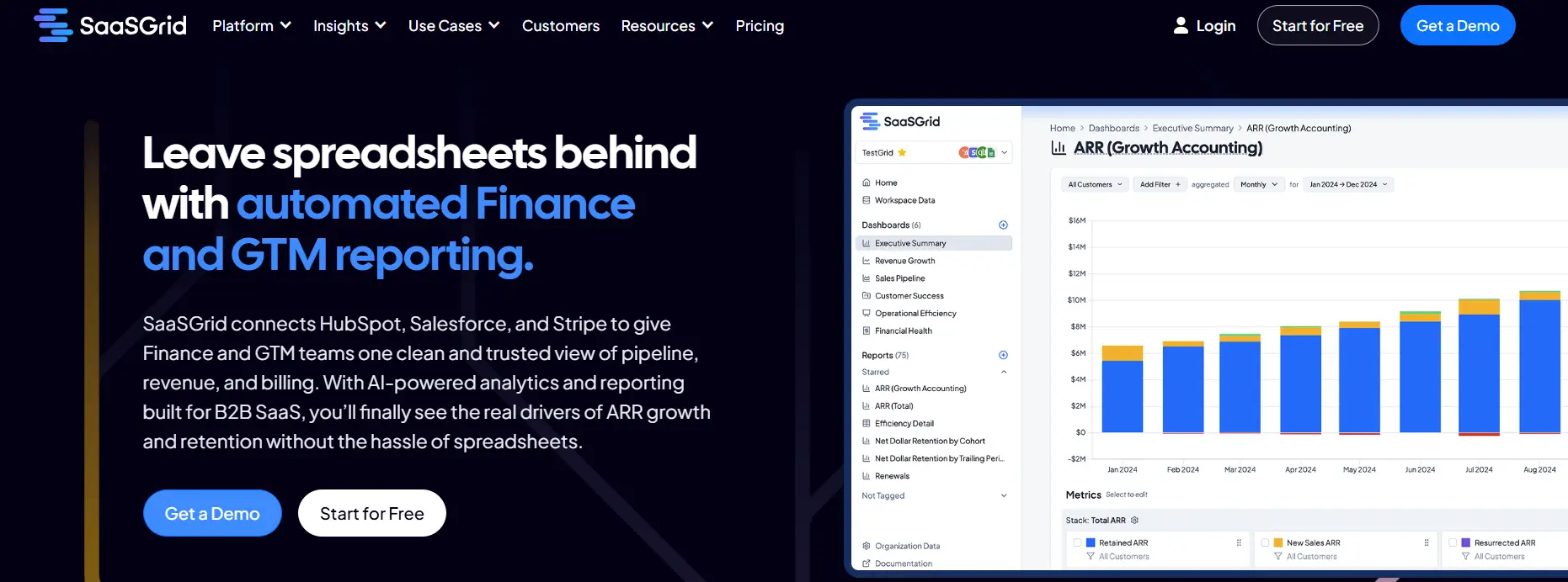
1. Grid: SaaS Analytics Tool Built for Subscription Businesses
Grid is a SaaS analytics platform designed to help subscription businesses track, analyze, and understand core revenue metrics in a structured and consistent way.
Price
Free to Custom Pricing
Ideal use case
SaaS Companies with >1M ARR
User Score
4.6 ⭐⭐⭐⭐⭐
This tool works with SaaS analytics by linking billing and financial systems like Stripe and accounting tools to create standardized views of ARR, MRR, churn, LTV, CAC, and cohort behavior. Grid cuts down on manual calculations and makes it easier to analyze revenue recognition by using predefined metric logic.
Grid is more of a purpose-built SaaS analytics tool than a general BI platform in real life. It has prebuilt dashboards, metric libraries, and segmentation options that let teams look at performance by customer type, plan, channel, or time period. Data quality checks show inconsistencies in source systems, which helps teams find gaps that make reports less accurate. Finance, RevOps, marketing, and leadership teams all use the platform to centralize SaaS analytics without having to do a lot of data modeling. Grid makes it easier for businesses that depend on recurring revenue to get to consistent metrics faster and lessens their need for spreadsheets for ongoing analysis.
What Users Like About Grid
Insight into SaaS metrics and flexible analysis
Users often say that Grid brings revenue and SaaS metrics together in one place and allows teams to break them down in ways that native billing or accounting tools cannot.
“The way Grid lets us slice and dice data is 10x better than anything you can do directly in Stripe or QuickBooks.”
–
Grant C.
Dashboards ready to go and reports that work for all teams
Reviewers say that Grid makes core SaaS analytics easier to understand for people outside of finance, reducing reliance on spreadsheets or specialized analysts.
“It takes the pain out of calculating metrics like ARR, churn, LTV, and CAC, and makes everything accessible through an intuitive, user-friendly interface.”
–
Verified User in Computer Software
Strong support and quick responses to feedback
Several users say the support team is fast and hands-on, and that the engineering team actively listens to customer feedback and improves the product.
“Support responds promptly to requests and as a relatively new platform, Grid’s product team is receptive to feedback and feature suggestions.”
–
Annie C.
What Users Dislike About Grid
While Grid provides powerful analytics and flexibility, some users report challenges related to usability and data configuration.
Platform complexity and learning curve
Some users find that Grid’s flexibility and depth of analysis make it difficult to learn at first, particularly for new users.
“Grid is pretty advanced. The depth and power of the platform can make it feel a bit complex at times.”
- Grant C.
Limited flexibility in data entry and metric definitions
Reviewers say there are constraints when working with data that does not fit predefined templates or when internal metric definitions differ from the platform’s defaults.
“The platform currently lacks flexibility for entering source data that doesn’t align with the predefined templates.”
- Annie C.
2. SAP Analytics Cloud: Unified SaaS Analytics Tool for Planning, Reporting, and Analysis
SAP Analytics Cloud is a SaaS analytics tool that lets you do business intelligence, planning, and predictive analytics using a single platform.
Price
Available through demo only
Ideal use case
Businesses with existing SAP landscapes
User Score
4.2 ⭐⭐⭐⭐
As a SaaS analytics tool, it helps businesses look at their financial and operational data in real-time. It allows users to visualize revenue data, by connecting to both SAP and non-SAP sources.
When revenue recognition is needed, it helps keep consistent reporting and forecasting by giving a single view of recognized and projected revenue across all of the business’ finance systems.
This SaaS analytics platform focuses on unified analytics instead of processing revenue transaction by transaction. It connects directly to systems like SAP S 4HANA, SAP Datasphere, and databases outside of SAP to create for you dashboards, reports, and planning models based on the most recent data.
Some of its main features include interactive dashboards, tracking for KPIs, modeling scenarios, and AI forecasting that can be used to look at revenue trends and predict performance.
The platform also lets finance and operations teams work together when planning workflows, so they can all see forecasts, budgets, and actuals in the same place. Natural language queries, predictive insights, and prebuilt content help teams look into revenue and business performance without having to rely on technical resources all the time.
What Users Like About SAP Analytics Cloud
A single platform for analytics, planning, and forecasting needs
Many users say that SAP Analytics Cloud brings reporting, planning, and predictive analytics together in one environment, helping replace multiple disconnected tools and ensuring teams work from the same data.
“SAP Analytics Cloud stands out for how seamlessly it brings analytics, planning, and predictive capabilities into one unified platform.”
–
Harvey A.
Real-time connections to SAP and non-SAP data sources
Reviewers often highlight live data connections as a major benefit, especially for organizations using SAP systems, since dashboards stay current without relying on manual refreshes.
“The live link to SAP systems ensures the figures are always accurate and current, which really boosts your trust in the insights you get.”
–
Hirdesh P.
Strong visualization, dashboards, and collaboration features
Users like creating interactive dashboards and sharing insights across teams, with built-in collaboration that supports planning and review workflows without moving data between tools.
“The interactive and intuitive dashboards offer a better understanding and faster insights, enhancing the overall decision-making process.”
–
kriti r.
What Users Dislike About SAP Analytics Cloud
SAP Analytics Cloud is used for planning and analytics, but some users report concerns related to performance, usability of advanced features, and customization limits.
Performance issues with large or complex datasets
When dashboards or models become larger or more complex, some users notice slower performance, which can affect planning and analysis workflows.
“Performance can sometimes slow down when working with large or complex datasets, especially in stories with many visualizations.”
- Harvey A.
Steep learning curve for advanced features
Many users say that while basic reporting is straightforward, advanced modeling, planning, and calculations take significant time and practice to master.
“The learning curve can also be a bit steep for new users, particularly when blending data or working with planning models.”
- Harvey A.
Limited flexibility compared to other BI tools
Some reviewers point out constraints in customization, visual styling, and integrations outside the SAP ecosystem, which may require workarounds.
“Compared to other business intelligence tools, you HAVE got some limits on how much you can tweak and style things.”
- Hirdesh P.
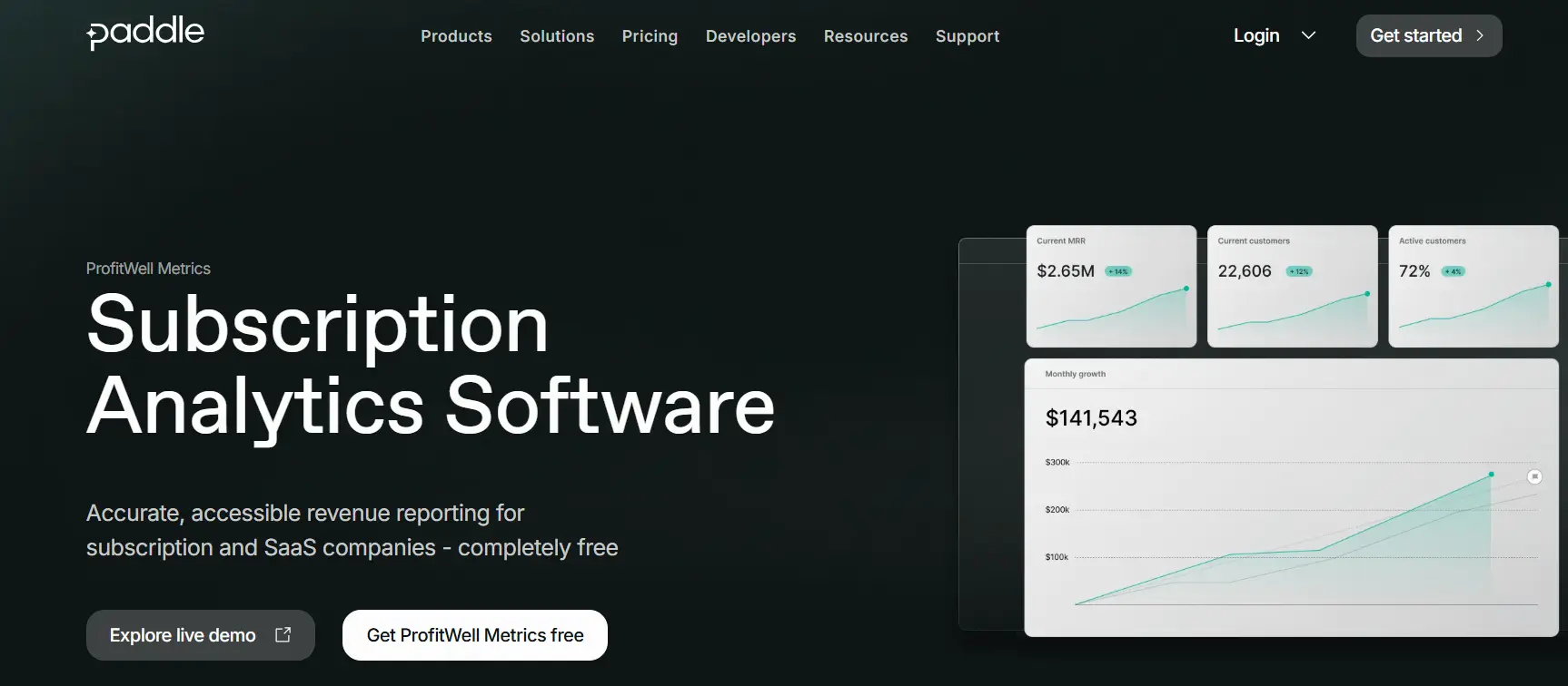
ProfitWell Metrics is a SaaS analytics tool made for subscription and SaaS businesses that need to see how their recurring revenue is doing in an accurate and automated way.
Price
Custom Pricing
Ideal use case
Subscription and SaaS businesses
User Score
4.8 ⭐⭐⭐⭐⭐
This tool works as a subscription analytics platform that connects directly to billing systems like Stripe, Paddle, Chargebee, and Recurly. It automatically calculates important metrics like MRR, churn, LTV, and ARPU. It doesn't fully recognize revenue, but it does help with revenue reporting by standardizing subscription revenue metrics and showing them in real-time dashboards.
ProfitWell Metrics' goal is to make SaaS analytics easy to use and tries to deliver trustworthy results for every team. Built-in benchmarking compares performance to a large dataset of subscription companies to give internal metrics more meaning.
Segmentation tools let you look at data by plan, customer type, or stage of the customer lifecycle. Alerts let you know about risks like rising churn or falling engagement. ProfitWell Metrics is a lightweight, purpose-built SaaS analytics tool that focuses on recurring revenue for companies that value subscription analytics over custom BI.
What Users Like About ProfitWell Metrics
Clear and accurate metrics for subscription revenue
Many users say that ProfitWell Metrics makes it easier to access key SaaS KPIs like MRR, churn, LTV, and ARR without relying on manual calculations or spreadsheets.
“ProfitWell takes your payment processor data and creates really solid reports and visualizations for you to show growth, churn, and more.”
–
Steve D., Head of Marketing
Easy setup and usability over time
Reviewers often mention how easy it is for non-finance users to navigate dashboards and how quickly the platform connects with billing systems.
“Immediately easy to view important metrics. I now have complete visibility into my growth and my churn.”
–
Taylor D., Founder
Tools that help retain customers and reduce churn
Users like the Retain and engagement features because they help identify delinquent churn and recover failed payments with minimal effort.
ProfitWell Metrics is used for subscription analytics, but some users report constraints related to billing complexity, customization, and data reliability.
Challenges with complex or non-standard billing scenarios
Some users say that handling complex billing setups, credits, or uncommon subscription models can be difficult.
Limited customization and reporting flexibility
Several reviewers note limitations in exporting data, adjusting metric definitions, or tailoring dashboards and reports to their needs.
Dependence on underlying data quality and integrations
Users emphasize that data accuracy depends heavily on the connected billing platforms, and that ProfitWell does not resolve upstream data issues.
4. Tableau: Visual SaaS Analytics for Revenue and Performance Analysis
Tableau is a SaaS analytics platform focused on data visualization and business intelligence. It helps organizations analyze revenue by connecting data from billing systems, CRMs, data warehouses, and financial tools, then presenting it in interactive dashboards.
Price
$75 to $115 per user/month
Ideal use case
Visualizing Interactive Data
User Score
4.4 ⭐⭐⭐⭐
While Tableau is not a native revenue recognition system, it supports revenue analysis by visualizing recognized revenue, deferred revenue, churn, and growth trends once those calculations exist in source systems.
At a deeper level, Tableau functions as a flexible SaaS analytics tool for teams that need self service reporting across large and complex datasets. It supports live and extracted connections to cloud databases, spreadsheets, and SaaS platforms, allowing finance, RevOps, and analytics teams to explore revenue data without relying on static reports.
Users commonly value its drag and drop interface, strong visualization capabilities, and ability to handle high data volumes. Tableau also supports role based access, scheduled refreshes, and sharing dashboards across teams. However, revenue logic and compliance rules must be managed upstream, as Tableau focuses on analysis and visualization rather than accounting workflows.
What Users Like About Tableau
Visual storytelling that is easy to understand and accessible to non-technical users
Many users praise Tableau’s drag-and-drop interface and its ability to turn complex datasets into clear, interactive dashboards that stakeholders can explore on their own.
“I use Tableau to transform raw, complicated data into interactive visual dashboards, which helps me tell a story with data so stakeholders can make faster, data-driven decisions.”
–
Somesh P.
Strong connections to a wide range of data sources
Reviewers often highlight Tableau’s ability to connect to, blend, and analyze data from many different systems with minimal coding.
“Tableau has made a significant difference for us by allowing connections to nearly any data source, including Excel, SQL, Salesforce, and Google Analytics.”
–
David P.
Automating manual reporting to get insights faster
Users say Tableau replaces time-consuming spreadsheet reports with live dashboards that update automatically.
“Before we used to make reports manually in excel, which took hours and had mistakes now dashboards update automatically and managers get real time data visibility.”
–
Janhvi R.
What Users Dislike About Tableau
Tableau is widely used for data visualization, but some users report drawbacks related to performance, data preparation, and cost and learning effort.
Performance issues with large or live datasets
Some users say that when working with very large datasets or live connections, dashboards can load slowly or experience lag.
“Sometimes dashboards take a bit long to load, especially when connected to live big datasets.”
- Raghini G.
Limited native data preparation and modeling
Some reviewers prefer to handle complex data transformations outside of Tableau, noting that its built-in preparation and ETL tools are limited.
“While the visualization is top tier the data preparation and native ETL capabilities are limited compared to competitors.”
- Vishal J.
High costs and steep learning curve for advanced features
Cost and the time required to learn advanced calculations are common concerns, particularly for smaller teams or startups.
“The performance can be improved because it does get slow sometimes. The pricing can be slightly less because it would seem expensive for a person in a startup.”
- ANSHUMAN .
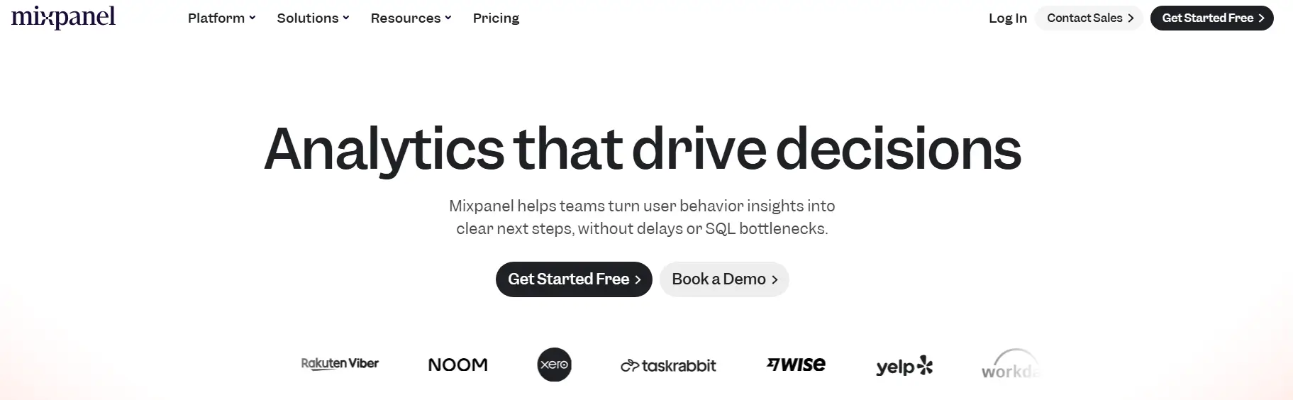
5. Mixpanel: Product Analytics for Behavioral Insights
Mixpanel is a SaaS analytics tool that focuses on analyzing products based on events. It helps teams figure out how people use digital products and how those actions affect conversion, retention, and revenue.
Price
Start for Free to Custom Pricing
Ideal use case
Product analytics for digital products
User Score
4.6 ⭐⭐⭐⭐
This tool doesn't track revenue, but it does help with revenue analysis by linking user actions to subscription events, upgrades, churn, and feature adoption that affect recognized revenue over time.
Mixpanel also collects detailed event data from web, mobile, and server environments. Teams use funnels, cohorts, and retention analysis to see how users go through the onboarding, activation, and subscription processes.
Reviewers say it allows them to take a look at real user journeys, fix problems by looking at user activity timelines, and check to see if changes to a product affect engagement or conversion.
It also has real-time dashboards, flexible segmentation, alerts, and A/B tests, aiming to help teams keep an eye on any changes that could affect revenue performance before it happens.
Mixpanel works with popular SaaS stacks and lets people who don't know SQL look at data. It is a good SaaS analytics tool for behavioral analysis, but not for accounting accuracy and ideally shouldn’t be used as a standalone revenue recognition platform.
What Users Like About Mixpanel
A clear view of how real users act and move
Many users say that Mixpanel’s detailed, step-by-step view of user actions helps teams understand behavior, diagnose issues, and validate product changes.
“When a user reports an issue, I can look up their profile and see their exact ‘User Flow’—literally the step-by-step actions they took right before things went wrong.”
–
Manu Y.
Flexible event-based analytics for faster decisions
Reviewers often highlight funnels, cohorts, and retention analysis as key features that help teams answer product questions without heavy analyst support.
“The event-based tracking is powerful yet intuitive, and the way you can slice data into cohorts, funnels, and retention curves is unmatched.”
–
Shubham K.
Easy setup and usability for non-technical teams
Many users say Mixpanel is quick to set up and can be used by product, marketing, and design teams, not just analysts or engineers.
“You're literally up and running with a few lines of code - no complex setup, no wrestling with documentation for hours.”
–
Ronaldo S.
What Users Dislike About Mixpanel
Mixpanel is often praised for its analytics depth, but some users highlight challenges related to learning advanced features, data discipline, and scaling costs and performance.
Steep learning curve for advanced features and data modeling
While basic usage is often intuitive, users say that more complex analyses require time and practice to master.
“The learning curve can be steep when you want to go beyond the basics, and sometimes I spend more time figuring out the right query structure than actually analyzing the results.”
- Daniel O.
Need for disciplined data organization and event tracking
Several reviewers point out that inconsistent event naming or insufficient planning can lead to messy or hard-to-interpret data.
“You have to be really strict with how you name events in your code. If you aren't careful, the data gets messy and hard to read.”
- Manu Y.
Pricing, performance, and support concerns at scale
Some users say that as data volumes grow, costs increase quickly, performance may decline, and support responsiveness can become an issue.
“The pricing also scales up quickly as your data grows.”
- Shubham K.
Closing Thoughts
It’s important to recognize that no one SaaS analytics tool is the best for all use cases.
Grid and ProfitWell Metrics are two examples of tools that help standardize subscription metrics and cut down on the amount of manual reporting work.
SAP Analytics Cloud and Tableau can do more with analytics and visualization, but they depend on upstream systems for revenue logic.
Mixpanel gives teams detailed information about user behavior that helps them link actions to trends in conversion and retention. However, it is not meant to be used for accounting accuracy.
The best choice for you will depend on what you and your team value more: subscription reporting, planning, visualization, or product usage analysis. It also depends on how these tools work with the data stack that is already in place.
Co-Founder and CEO at Grid. Ethan has over 10 years of experience in SaaS. He created Grid to help businesses get clear data without having to spend hours wrangling data and writing SQL queries.
Grid and traditional Financial Planning and Analysis (FP&A) platforms each offer powerful reporting capabilities and operational clarity for growing SaaS companies.