Compare user experience to find the best Power BI alternatives for SaaS, finance, and revenue teams.
Power BI is a popular and flexible analytics platform, but it might not be the best choice for every team.
A lot of companies need tools that don't just show them generic dashboards but also help them with specific tasks like SaaS metrics, revenue forecasting, billing, or sales execution.
This article talks about a few of the best Power BI competitors and alternatives. It uses real user reviews and experiences to help you find the best tool to solve your analytics problems.
What's the best alternative to Power BI?
The best alternative depends on why your team is looking to move away from Power BI.
That means that another general-purpose BI tool isn't always the best replacement. A self-service analytics tool, an open-source option, or a reporting platform that focuses on revenue may be a better fit at times.
Here’s a quick replacements guide depending on your needs
Grid for SaaS revenue reporting, ARR analysis, and finance alignment
If the problem isn't general BI but revenue reporting itself, Grid might be a better choice. A revenue-focused platform can be more useful than a general BI tool if a team mostly needs ARR, churn, retention, CRM-finance reconciliation, and investor-ready SaaS metrics.
In that light, Grid stands out because it’s designed for SaaS reporting workflows instead of general dashboarding. That makes it especially useful for finance, RevOps, and leadership teams that want consistent metrics but don't want to build and keep up a full BI stack.
Sigma for warehouse-native analysis and spreadsheet-style work
If your team already uses a cloud warehouse and wants a more spreadsheet-like interface, Sigma is a good choice. According to Sigma's official materials, it’s an analytics workspace that works with spreadsheets, live queries, and writeback workflows.
That makes it helpful for finance, operations, and analytics teams that want to do controlled analysis without sending data back to spreadsheets.
Metabase for open-source BI and simpler reporting
For teams that want a less expensive and lighter BI setup, Metabase can be a solid choice. The official website calls it an open-source business intelligence platform that lets you create dashboards, ask questions on the fly, and embed them.
It works better for startups, internal teams, or product-led companies that want to make reporting easier without the complicated setup that comes with bigger enterprise BI tools.
The Best Power BI Alternatives & Competitors
Tool
Best For
Strengths
Limitations
Pricing
User Score
GridTop Pick
SaaS companies with >1M ARR that need subscription-focused analytics
Built-in SaaS metrics like ARR, MRR, churn, LTV, and cohorts
Prebuilt dashboards and standardized metric definitions
Direct integrations with billing, CRM, and accounting systems
Reduces manual calculations and spreadsheet-based reporting
Depth of features can create a learning curve
Limited flexibility for data that does not fit predefined templates
Free to Custom Pricing
4.6
SAP Analytics Cloud
Organizations with existing SAP environments
Unified analytics, planning, and forecasting in one platform
Live connections to SAP and non-SAP data sources
Interactive dashboards with collaboration features
Performance issues with large or complex datasets
Steep learning curve for advanced modeling and planning
Less flexible than some standalone BI tools
No out of the box revenue nor SaaS metrics
Available through demo only
4.2
ProfitWell Metrics
Subscription businesses focused on recurring revenue analytics
Automated calculation of subscription KPIs like MRR and churn
Fast setup with direct billing integrations
Benchmarking against other subscription companies
Limited customization and export options
Challenges with complex billing scenarios
Dependent on accuracy of billing system data
No ARR reporting
Custom Pricing
4.8
Tableau
Teams that need flexible, visual analytics across large datasets
Advanced data visualization and interactive dashboards
Broad connectivity to databases, warehouses, and SaaS tools
Supports self-service analysis at scale
Performance issues with large or live datasets
Limited native data preparation and modeling
Higher cost and learning curve for advanced features
$75 to $115 per user/month
4.4
Mixpanel
Product teams focused on behavioral and event-based analytics
Detailed event-based tracking and user journey analysis
Funnels, cohorts, and retention analysis without SQL
Real-time dashboards and alerts for product usage trends
Not designed for accounting or revenue recognition accuracy
Requires disciplined event naming and data governance
Pricing and performance concerns at higher data volumes
Free to Custom Pricing
4.6
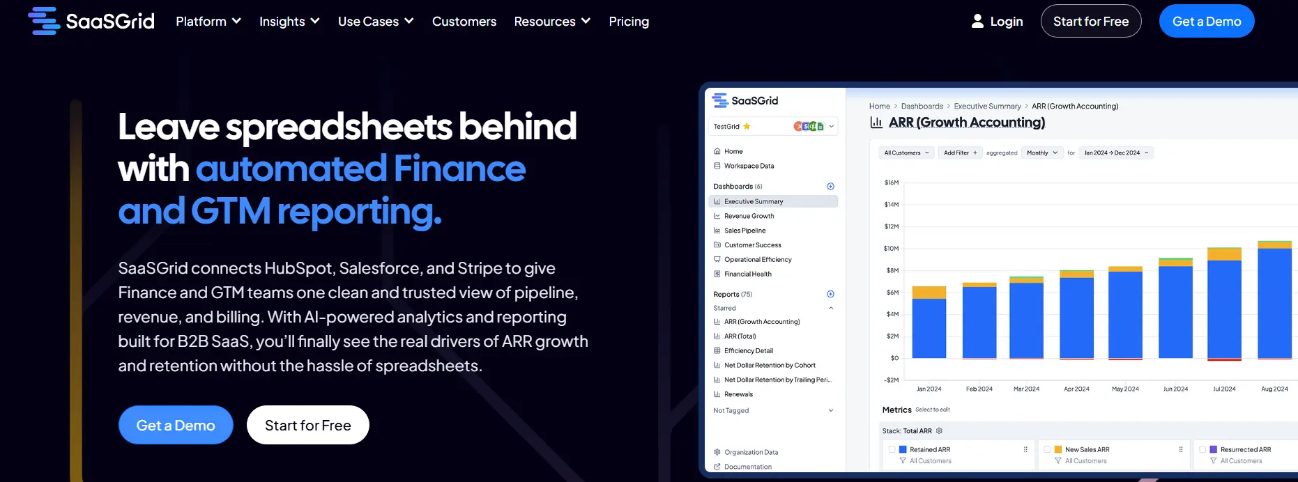
1. Grid: Specialized Revenue Analytics for SaaS Businesses
Grid is a focused analytics platform made just for SaaS companies that need accurate metrics, financial reports, and revenue insights without the hassle of a broad BI environment.
Price
Free to Custom Pricing
Ideal use case
SaaS Companies with >1M ARR
User Score
4.6 ⭐⭐⭐⭐⭐
For teams that care more about subscription metrics than general-purpose dashboards, it is a great alternative to Power BI.
Power BI is flexible and has a lot of ways to visualize data, but Grid comes with built-in SaaS metrics, connects directly to billing and CRM systems, and makes data modeling less complicated.
Companies use it to keep an eye on ARR, MRR, churn, LTV, CAC, and cohort behavior in a way that Power BI needs a lot of setup to do the same. Its built-in templates, automated data pipelines, and SaaS-specific reporting often help finance, RevOps, and leadership teams get value faster.
What Users Like About Grid
Grid users like how it makes complicated revenue reporting easier and SaaS metric calculations faster.
These are things that are hard to do in Power BI without advanced modeling.
SaaS metrics made just for this purpose and advanced segmentation
Users like that Grid can break down and analyze subscription data in great detail without a lot of setup.
“The way Grid lets us slice and dice data is 10x better than anything you can do directly in Stripe or QuickBooks.”
- Grant C.
Great customer service and quick implementation
Many reviewers say that the support and engineering teams are very responsive, which is different from how hard it is to fix Power BI environments.
“The support and success team is proactive, receptive, and readily available.”
- Sam H.
Simple to connect to SaaS tools and automatic reporting
Users say that Grid connects to systems like Stripe, HubSpot, and QuickBooks very quickly, which lets them see core SaaS metrics right away without having to build custom models.
“The most useful reports and charts prebuilt and easily integrated with Hubspot and a myriad of other tools.”
- Dev D.
What Users Dislike About Grid
Most of the feedback is good, but a few users point out things that could be better about the platform.
Some setup steps and admin tasks could be easier to understand
A few reviewers mention that certain configuration and admin workflows feel more complex than necessary.
“A few small admin reports and dashboard configuration steps could be simpler or more user friendly.”
- Sam H.
Pricing changes for companies with more than $1 million in annual revenue
Some reviewers note that pricing is best suited for a specific type of SaaS business once revenue passes a certain threshold.
“Recently it has become paid for customers with more than 1m in ARR.”
- Zishan K.
2. Tableau: Advanced Visual Analytics for Interactive Business Intelligence
Tableau is a popular business intelligence platform that focuses on interactive data visualization and visual analytics.
For teams that value flexible dashboard design, exploratory analysis, and visual storytelling across many data sources, it is a good alternative to Power BI.
Tableau can connect to cloud warehouses, databases, spreadsheets, and enterprise systems. This makes it easy for users to make interactive dashboards.
Power BI works well with other Microsoft products, but Tableau is often chosen by companies that want more freedom in visualization and website design, better exploratory workflows, and broader adoption across platforms, especially in data-driven organizations and analytics-heavy teams.
What Users Like About Tableau
Flexibility in visualization and storytelling
Users often talk about how Tableau can turn complicated datasets into interactive, well-designed dashboards that are easy to explore and present.
“Features like advanced mapping and the ability to finely tune every visual element allow us to create highly customized, interactive dashboards that summarize complex data beautifully.”
- Vishal J.
Easy to use drag-and-drop interface with little coding
A lot of reviewers talk about how Tableau lets you analyze data quickly without needing to know a lot of technical stuff, especially when compared to tools that rely more on formulas or modeling.
“Ease of Use scalability various connectors for integration no issues like dax of power bi simple calculated fields fabulous graphs.”
- Ashutosh J.
Live analysis and connections to a wide range of data sources
Users like that Tableau can combine data from different sources and work with live connections to explore large datasets.
“The ability to connect to multiple data sources and create live, real-time dashboards is also a huge plus.”
- Gaurav S.
What Users Dislike About Tableau
While Tableau is widely used for data visualization, some users point out specific drawbacks.
Difficult to learn advanced features
Users say that making basic dashboards is simple, but advanced calculations and deeper customization take time and practice.
“Once you start getting into calculated fields, data blending, or parameter actions, the learning curve becomes noticeable.”
- Manan B.
Problems with performance when working with big or live datasets
When people work with complex dashboards or large volumes of data, some notice slower load and refresh times.
“Sometimes dashboards take a bit long to load, especially when connected to live big datasets.”
- Raghini G.
Small teams have to pay a lot for licenses
Pricing is a common concern, especially for small and medium-sized businesses considering long-term adoption.
“One downside of Tableau is its high licensing cost, which can be a barrier for smaller teams.”
- Verified User, Enterprise
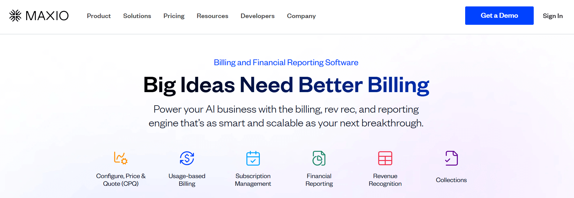
3. Maxio: An Alternative to Power BI for SaaS Revenue and Finance Analytics
Maxio is an alternative to Power BI that offers solid finance and revenue analytics.
If your team needs embedded financial analytics instead of a general-purpose BI layer, Maxio is a possible choice.
Maxio is not made for dashboards that pull data from many sources. It is made for B2B SaaS finance and RevOps teams that need accurate billing, revenue recognition, and SaaS metrics all in one place.
It has built-in ARR and MRR analytics, as well as subscription billing, invoicing, and reporting that follows GAAP. For businesses that need their revenue data to be ready for an audit and closely linked to billing workflows, Maxio takes the place of manually modeling these metrics in Power BI.
What Users Like About Maxio
Metrics and revenue visibility made just for SaaS
Users say that Maxio comes with SaaS-specific metrics right away, so finance leaders can keep track of ARR, churn, and renewals with less setup than they would have to do in Power BI.
“SaaSOptics provides total clarity and insight into your SaaS business. Reports showing Logo, Gross MRR/ARR Churn, Net MRR/ARR Churn, New MRR/ARR, Contraction MRR/ARR, etc. are available and updated in real-time.”
- Darin J.
Strong automation for billing and revenue processes
Power BI only shows data, but Maxio automates the billing and revenue processes that make it happen. Users like having less work to do by hand and fewer spreadsheets.
“Switching over to Maxio has not only saved me hours each month on the revenue, invoicing, and bookings reconciliation.”
- Verified User, Small Business
CRM and accounting systems that work together deeply
Users often say that Maxio brings together billing, CRM, and accounting data in one place, which means they don't have to put together data from different sources in a BI tool.
“It allows us to view payments from Stripe and PayPal into one platform. We are able to modify the subscriptions there, update customer information, and it is much easier to send invoices.”
- Pearl R.
What Users Dislike About Maxio
Maxio is used for billing and revenue operations, but some users point out limitations that affect reporting, setup, and scalability.
Reporting gaps in flexibility and customization
Some users think that the built-in reporting is not as flexible as BI tools like Power BI, which often leads teams to export data to Excel.
“I don't like the charts in Maxio. They are not as flexible as what I would like, so I often have to download the information into Excel.”
- Ellen G.
Difficulty in setting up and learning
Users say that setup and configuration can take a long time, especially for complex billing models or data migrations.
“Setting up billing takes a considerable amount of time, and overall, the system tends to be quite slow to operate.”
- Matthew H.
Problems with performance and integration in more complex situations
Some users experience slow performance or integration issues when working with multicurrency data, large-scale subscription changes, or accounting systems.
“Subscription changes take a long time to perform and do not integrate correctly with accounting software.”
- Verified User, Mid Market
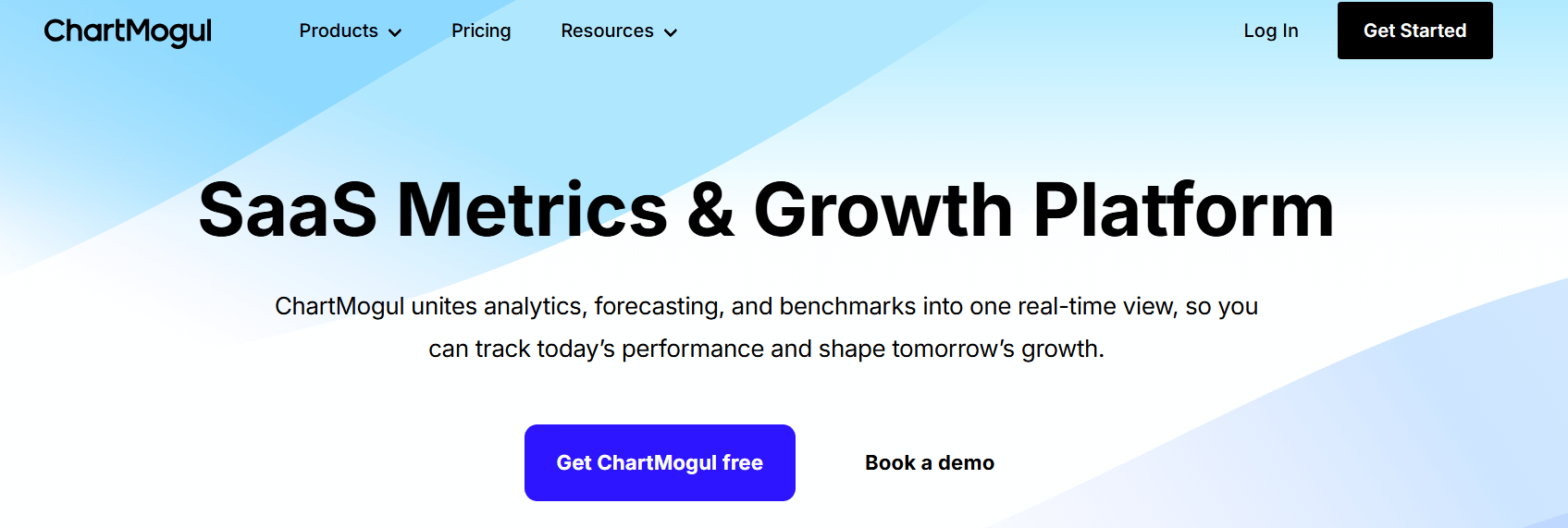
4. ChartMogul: A SaaS-Native Alternative to Power BI for Subscription Metrics
ChartMogul is an alternative to Power BI for SaaS and subscription businesses that need ready-to-use revenue analytics rather than a general BI workspace.
If you run a SaaS or subscription business and need ready-to-use revenue analytics instead of a general BI workspace, ChartMogul is a good choice.
Teams don't have to start from scratch to make models and dashboards. Instead, they connect billing systems like Stripe or Chargebee and can see MRR, churn, retention, and cohorts right away.
The platform comes with SaaS-specific revenue logic built in, which makes it easier to set up and keep up with than Power BI.
What Users Like About ChartMogul
You can get SaaS metrics right away without having to do a lot of work
Users always say that ChartMogul gives them the most important SaaS KPIs without having to do complicated modeling or data preparation.
Using standardized definitions for metrics like MRR and churn makes it easier for teams to work together than with Power BI.
“Easy of use and preconfigured insights. Works right out of the box.”
- Albert D.
Dashboards that are easy to read and show the health of a business at a glance
Reviewers often talk about how easy it is to understand performance without having to deal with complicated reports or filters.
ChartMogul is easier for founders and operators who don't want to deal with BI tools because it focuses on high-level visibility.
“Helps me understand how my business is doing, at a glance, super easy to set up.”
- Steven P.
Native integrations with billing platforms make reporting easier
Users like how easy it is to connect directly to billing systems, which cuts down on the need for custom data pipelines and ongoing maintenance.
This method cuts down on the manual work that Power BI users often have to do when handling data about recurring revenue.
“Proper definitions of SaaS KPIs by definition + easy integration with billing platforms.”
- Piotr K.
What Users Dislike About ChartMogul
ChartMogul is widely used for subscription analytics, but some users report limitations that affect accuracy, cost, and integrations.
Data edge cases can require manual checks
Some users report that specific billing scenarios, such as corrections or marketplace transactions, may be misclassified. As a result, teams sometimes need to review movements manually to ensure accuracy.
“Sometimes Atlassian Marketplace transactions are mistakenly displayed as contractions/churn.”
- Viktoria M.
Some teams are unhappy with the price increases
A few reviewers say that changes in prices over time made it harder to keep using the platform and harder to justify the cost compared to other BI tools.
“They doubled, then re-doubled their prices. Basically forced us to leave.”
- Verified User
Some tools don't work well together or only work sometimes
Some users report gaps in certain CRM and marketing integrations, which can make later analysis more difficult. In these cases, teams may need to export data or rely on other tools to get a complete picture.
“It doesn't update with things like HubSpot for better data analysis.”
- Steven P.
5. Clari: Revenue Forecasting and Pipeline Intelligence for Go-to-Market Teams
Clari is an alternative for businesses that want to focus on sales execution, pipeline management, and revenue forecasting instead of general business intelligence.
Clari doesn't focus on broad data visualization across departments; instead, it focuses on revenue operations. It gets data straight from Salesforce to show you how healthy your pipeline is, how accurate your forecasts are, and how risky your deals are in real time.
This means that sales leaders and RevOps teams no longer have to make and keep up with complicated Power BI dashboards for forecasting and pipeline analysis.
What Users Like About Clari
Clear visibility of the pipeline and clear forecasting
Users say that Clari's ability to combine pipeline data into focused views makes it easier to understand and act on forecasts.
Power BI often needs custom modeling to get this level of clarity.
“The platform's capability to provide a clear overview dropdown for several analyses is highly valuable”
- Gustavo G.
Strong onboarding and help for customer success
Many users say that Clari's onboarding and ongoing support help teams use forecasting workflows faster than other BI tools.
“Honestly, the onboarding process, ongoing support, and responsiveness we've experienced have far outweighed any technical issues we've encountered with Groove.”
- Cyndy M.
Good integration with Salesforce makes workflows run more smoothly
Clari's deep integration with Salesforce cuts down on the need for manual updates and keeps forecasts in line with CRM data,
which is something that Power BI often needs to do.
“I like the ability to easily change important fields in Clari and Salesforce with one click.”
- Courtney R.
What Users Dislike About Clari
While Clari is commonly used by revenue teams, some users highlight limitations that affect day-to-day usability.
Problems with the interface and navigation
Some people think the interface is less intuitive, especially when switching between views or reviewing historical data.
“I find navigating Clari to be somewhat cumbersome.”
- Brennan C.
There isn't much flexibility in filtering and reporting
Users say that compared to general BI tools, the filtering options and report customization are limited.
“I find the filtering and exclusion capabilities somewhat ineffective.”
- Tricia B.
A lot of dependence on the quality of CRM data
Clari’s accuracy depends heavily on how well Salesforce is configured and maintained, which can reduce its value for less mature RevOps teams.
“Clari is only as good as your Salesforce hygiene and your internal operating rhythm.”
- Verified User in Marketing and Advertising
Why do users leave Power BI?
Users usually don't leave Power BI because it doesn't have enough features. They leave because it can become too expensive or complex for them to use.
If this sounds familiar, you know what we’re talking about.
The learning curve gets steep
The main reason is that learning Power BI can be hard. Many users are fine with reading reports, but creating and keeping up with more complex models often requires DAX, data modeling, and technical setup that smaller teams or non-technical users don't want to deal with.
Performance can become a problem at scale
Another common reason is performance once you reach a certain size. Reviews often say that as datasets get bigger or models get more complicated, reports take longer to run, maintenance is harder, and there is more friction. This makes some teams look for tools that are either more native to the warehouse or easier to use for their reporting needs.
Licensing and sharing can feel restrictive
People also leave because it can be harder to manage licensing and sharing as more people use the service. Some teams start with Power BI because it works well with their Microsoft environment. However, when more business users need access, they run into problems with governance or distribution.
Conclusions
There isn’t a single software that can take the place of Power BI for all situations. Grid and ChartMogul are great for SaaS companies that want accurate subscription data without having to do a lot of modeling.
Maxio is a good choice for teams that need their analytics to include billing, revenue recognition, and finance workflows. Tableau is still a great choice for exploring and telling stories with data from many sources. Clari is the best choice for revenue teams that care most about pipeline health and forecasting accuracy.
Your data maturity, team needs, and how much control you want over setup versus speed to insight will all affect which option is best for you.
Your business needs accurate ARR tracking, see how these reporting tools compare and which fits your revenue model, data complexity, and reporting needs.